Management methods are way to help keep a team organised and on track to target goals and requirements.
Waterfall is a linear project management where each stage of the project is completed before moving on to the next one. The advantages for waterfall management style are that it is simple and straightforward so it makes sure that you complete all the tasks. This management style also allows for better organisation so everyone know what they’re doing so it doesn’t require as much direction from a leadership role. Because of the ridged structure, it makes changes later down the line more difficult. If the management style was for a large team there is a possibility that parts of the team would be limited on what they can do as they waiting on another part of the team.
Agile is a flexible management style where development is done in smaller more manageable chunks in timely iterations, testing each part long the way. Because of agile being flexible you can easily make changes down the line as your’re constantly testing and changing as you go through he cycle. It allows everything to be checked if it working along side other parts of the project which is particularly helpful when it comes to games design. Strong leadership is required so that everyone knows what they are doing as it could get quite easy to become confused. Another thing is that……
Scrum is a variation of the agile management style where everyone pitches in and discusses what needs to be done next. It allow for greater communication and influence for the people working on the project. It also gives a chance for people to bring up any issues so that they can be sorted quickly and efficiently. This method requires a strong leader as somebody needs to control the group and making final decisions so that production isn’t halted. Because people can debate what they need to do next, it could lead to arguments that could leads to miscommunication and noncooperation.
For my project I feel that scrum would fit best with what I like to do as I can prioritise what needs to be done in the project to have better control over my project. As i am a one man team I feel that it would be good to regular feedback from tutor’s and peers so I can check other people’s opinions so I can figure out the best course of action.
pitch presentation
project proposal
Ideas:
2D fighting game
cupheads/skull girls style
metroidvania type game
contra-like metroidvania game (combines both core ideas)
rpg/statergy game wow fire emblem
character creation
Before creating my 2D plat-former characters i wanted to see how other games make there characters stand out this lead me to create pastigue drawings of the most iconic platform characters of recent years.
Hollow Knight has a very simple design just being a skull and wearing a cloak. He has almost a monochromatic colour scheme which helps the bleep tone of the game. his form could be represented by a square and a triangle for his cloak this further adds to his design as it makes hi easily recognizable. Game play wise this makes him easy to animate and to make him easily distinguishable from the background and other characters on the screen.
The next game i reserched was a game called Cellest. The main character Madeline has another simple design as she is wearing standard winter clothes as she is climbing a mountain in the game. Her hair and her jacket are contrasting colours showing the two main reasons why she is climbing the mountain. Her grief is represented in her jacket and her will and determination to get to the is shown in her orange hair. In game her form is pretty much a square and her bright orange hair makes it easy to distinguish her from the back ground as there are few enemies.
The next and final game i researched is Katana Zero. The character Zero has a similar colour scheme to Hollow Knight being monochromatic. Which makes him stand out because the back ground and the enemies are very vibrant in colour. His sword is red because of the amount of people he has killed showing the dark setting of the game.
Struggling to think of my own idea one of my tutors suggested to get everyone to write down random words on bits of paper, put them in a bag and draw a few to get the idea going. Through this i got the ideas of a ghost knight and a astronaut. I prefered the idea of the ghost knight so i did an initial sketch but i disliked how common knight were in platformer’s as i meant my character wouldn’t stand out. So i decided against carrying on with the idea and started looking else where.
The next place i looked was folk law as they have so many interesting stories that you could base a game off. One of the stories was from Gipsies about a prince setting off to find a golden apple for hi ill father. It was good because he faced many dangers and had a time limit keeping the game short. Because it had a similar type of Knight character that i disliked i moved on towards the Gipsies themselves. It was suggested i mixed travelling Gipsies and the circus together.
In this project I am going to create and explore my business identity and also looking towards the future. This will include looking into universities or further education applying to UCAS, writing my personal statement, making a portfolio, logo, business card, artist statement and an art station account. This is because i think they are relevant to furthering my education, recognize the skills i have and the ones I don’t while starting to develop my business. I will be required to submit the tasks that have been presented, my UCAS personal statement, the logo and business card.
Skills Audit:
This unit is about preparing me for the future, after college. Over the past year I have gained skills in:
Photoshop Drawing Clear Communication Problem solving
3DS Max Positive Attitude Empathy Conflict Resolution
Unreal Engine Good Humor Organisation Teamwork
I think from the skills I have, my areas of strength and improvement have been that I continued to improve in different Programs That I use daily like 3DS Max and Photoshop as well as conflict resolution and empathy. This is because I have been practicing and using the different programs, keeping cool when deadline draws close and organizing to keep my work focused and precise. Before I leave college I could still develop in all areas but I particular want to improve my drawing skills as I would like to do the more artistic side of the game industry. I think I can improve these skills by competing a quick sketch every few days to practice my skills in drawing.
Action Plan:
After college I would like to attend university because it is the most common way in getting into the field of work I want to get into but I am also looking out for any apprenticeships as their uncommon but I think it’s another good option for me. Full-time work is an option but I would rather do something that I enjoy which would mean that I would have to do a degree or apprenticeship first.
I have mainly researched universities due to industry I would like to get into so I researched a very variety of different universities that are consider great for people who want to get into the games industry. Some of the universities I have looked into are Hartfordshire, Falmouth, Plymouth, Plymouth college of arts, Escape Studios, Teeside, Stockholm and London college of arts.
My top five options are Game art and Game development art at Falmouth university, Game art at Plymouth college of arts and Game development art and Concept art at Teeside university as I prefer the art side of the course I’m currently on but I do also the other areas as well. These have my prefered courses, aren’t too far away and they look like they are interested in the course their are teaching.
Ucas/Next Steps:
Personal statement:
I am applying for this course because it will help me to bolster my skills and improve on what I already know about the gaming, VFX and animation industries. I have been interested in gaming for many years but more recently become interested in the finer details of how the industry designs and makes games and movies. I find the subject stimulating; therefore, I would like to attend your course so I can learn more about the games industry, how games, shows and movies are made and why they work so well.
At present I am attending Callywith College taking an Extended diploma in games, VFX and animation which will give me a good foundation to study on your course. The modelling and designing parts on my present course have been particularly interesting because I can make what I want into reality. The skills I have learnt through and outside the course are, painting / digital painting, drawing, modelling, rigging, texturing and coding through 3D programmes or by hand. I have used all of these processes in my projects, such as making a car, designing a character or making an environment.
I have gained new skills from work experience at Chadd’s Foodsmiths, Studio 14 and Triangular pixels. Chadd’s Foodsmiths is a wholesale food delivery company that I helped out an accountant, delivery drivers and warehouse workers. I was trusted to count the week’s takings, worked in the office doing inventory checks, making sure products were in date and that there were sufficient supplies for clients, updating what needed to be ordered where necessary and other general tasks.
The game developer Studio 14 set our class a live work experience brief for their new upcoming game Exodus Rising. I was the leader in a group that was tasked with making a castle court and garden environment as well as managing the other members of the group. We used 3DS Max and Photoshop to produce the environment and assets for the game. We had to stick to the guidelines and the concept art we were given to help us understand the feel and style of the game.
I designed a tranquil Japanese garden for a local company, Triangular Pixels. This experimental project used virtual reality to give people with mental health problems a safe and calming place to go without leaving their home or hospital. We got together with young people and practitioners from the Sowenna Unit to discuss what they found calming and what to avoid.
I have been a part of scouting since I started as a Beaver and continued up through to Scouts. It gave me responsibility, taught me perseverance, helped me make friends and take part in the Scout Jamboree. In my spare time my family and I have competed in archery competitions; I won a gold medal as well as giving me a chance focus on a sport that needs precision and patience, improving my hand-eye coordination. As I’m a good swimmer my school encouraged me to take a Junior Lifeguarding course which lead me to help put together a lifeguarding event at the local beach, making sure things ran smoothly and sorting out any problems that arose.
I have always like to draw characters from shows, games and movies but more recently I have also been interested in 3D landscapes and models. I find that landscaping gives me the scope to use my ideas and helps me imagine a world for my characters. I like making my landscapes as close to what they would be like in reality. Giving the terrain character, movement and somewhere to lead your eye to. I play miniature wargames for similar reasons, because I like the forward planning and strategy of the game, but also the other side, which involves painting and building the models. I enjoy all types of gaming, from story driven to multiplayer games.
I feel I am suitable for this course because I want to expend my knowledge of games design, improve my own characters and worlds and ultimately work in the industry. I hope to achieve this by completing your course. Thanks for your consideration.
To apply to universities, I have to apply to Ucas as it standifys applications to make an easier, more uniform way to apply. I had to fill out different areas like basic information, background, education etc. Then I had to write my Ucas statement and fill out my qualification.
For the three universities that I have applied for some of the upcoming open days are the may 22 for Falmouth, february 29 for Teeside and february 8 for plymouth college of arts. I have been to Falmouth twice once with the college and once with work experience but I haven’t been unable to go to the other two. For Falmouth there is just a interview but with teeside and plymouth college of arts I also have to provide a portfolio as well as an interview. I am expanding my work for my portfolio, for some of the interviews I have to do.
Professional Identity:
For this section i’m going to design and create a logo, business card and statement. I am hoping that I am able to create my desired identity and present it in a acceptable manner.
My first group of designs is all to do with my initials or variations of my initials. My inspiration for this type of design was to make my logo simple and easily recognizable that it’s my logo. I when through multiple types of front, style etc such as slanting letters or joining the letters up in one line. With the experimentation I was able to explore other ideas through this idea and create some unique and ideas. Proceeding from my first idea, I thought of using my initials to use as a basis to build a space ship. I think keeping it simple look better as my later designs looked like a pencil. Finally, I’ve collected my more experimental ideas into a group as they don’t fit many other category. These are ideas that I’ve had but I didn’t feel as though they fit my criteria. I think if I was to improve upon this / complete a similar task again I would make higher quality drawing rather than brainstorming doddles.
After my initial ideas, I settled on a space ship design and moved it into photoshop to create the shape and the intricate details. I then choose the colours inspired by baby driver. I particularly like the colour choice as it is unusual compared to most sci-fi ships. I think it took way too long to settle on an idea so I felt that it took to long.
This first idea came from a card game that I was playing recently (Magic The Gathering) but instead of a creature on the card, it would be my business card. I started blocking out the key features but I decided against using the idea as I feel using my logo would be out of place. My second idea was based on using my logo and the colour scheme used before adding a bit of motion. My third idea was an alteration of my second idea but giving it more life and flow to the business card without over cluttering it. I think the third idea is best because the pink is bold and eye catching and leaves room for my details as a business card is suppose to be remerable so the possible employer remembers you. I think I could improve the flow between the front and the back as it would be more ascetically pleasing. If I started this task again, I would focus more on my logo than exploring other possibilities as it is already good.
I like the changing front colours as you look down the business card and how the subtle gradient adds to it. I think it needs a little more refinement as the images in the backgrounds are a little fuzzy compared to the front. I think it went well overall but similarly to the previous task it got bogged down amongst other work.
new artists statement:
My name is Alastair Hambly and I am currently a student at Callywith College, finishing my final major project for my course. In the near future I’ll be tending university continuing my passion for games design, art and vfx. My skill set in particular is art and design but I know photoshop, 3ds max, maya, unreal and python programs so in turn programming, animating, texturing and rigging. I like to do a verity of different things and will jump at the chance to do something new so I can improve upon my current skills.
I based my statement on my old artist statement that i did last year, I looked on Artstation for examples and realized that their statements were a paragraph or less so I focused on shortening down and improving my previous statement from scratch. I believe my updated statement is better for a variety of reasons as it get to the point, states what i know and what i’m going to do to improve further. Hopefully I will be able to continue updating my statement throughout my stages of my career, like in university and future employment.
Artstation section
Artstation is a platform where artists etc can post their work and employers can search for people to their specification to employ for their projects. The website is used by many professional and amateur artist likewise as you can keep a record of their work as they can post any type of media. This is both useful to start out and have your work exposed and get reliable source of recruitment. Artstation is a good way to gain contacts in the artistic industry which could lead to job recommendations and/or offers but their are alternatives like DeviantArt which is a less professional based website where people can offer more friendly advice but might be less useful. You could also even make your own website but you need to be a lot more active and it could easily look worse than the UI of Artstation or its alternatives.
I choose these images as I feel they are representsome of the best of what I can do at the time as they give a wide range of media that I have beenpracticingand learning across my life.I hope if a stranger found my profile page they would find my work enjoyable and eager to see what I do in the future when I practice more and get better at what I do.The benefit of using an online portfolio is that it can be accessed from anywhere that has the internet so it’s their when you need it and it can’t get broken, damaged or lost. I think after every piece I do, I believe that it could be improved upon and so strive to produce new and better work.
For this character project, the aim is to create a character, animations and an environment, based on an existing game from one of the companies listed on the brief which are Nintendo, Naughty dog, CD Project Red and Blizzard. The project is to cover 2 two units for my course but also to start getting us used to a design and style that isn’t our own. Each of the companies have given us two games to choose from and I was thinking of ether Overwatch (from Blizzard) or Cyberpunk 2077 (from CD Project Red). The two main points that I am going to research are character analysis and aesthetic awareness but alongside that other forms of research like mood boards, comments from the creators, practice sketch and other forms like it. I am hoping to making at the end, a fully rendered, detailed, animated and textured character as well as a small environment for my character to be in.
Research (Task 2):
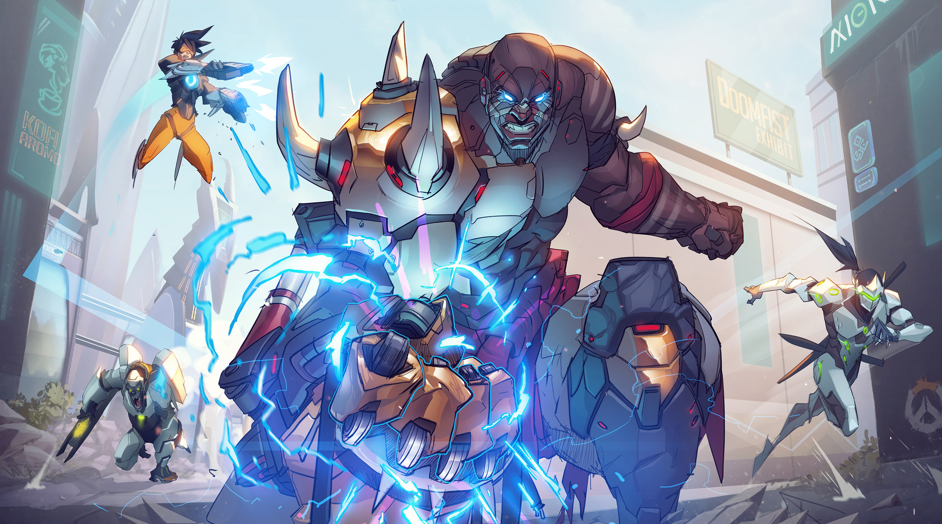
Doomfist
For my first character I’m going to analyse, I have chosen Doomfist. Doomfist was an heir to a well-regarded Nigerian prosthetic-technology company. He continued his family business and spent his free time on competitive martial arts until he lost his arm in the Omnic crisis, then he was recruited by the second Doomfist to join the Talon organization. Talon believes that humanity would be made stronger through conflict resonated with Doomfist’s personal experiences. While the Second Doomfist was content to profit from raids on Numbani, he had a grander vision. This difference lead him to kill his teacher and take on the mantle of Doomfist. As the new Doomfist, he rose high in Talon and helped to plan a major conflict but before it could start, he was defeated and captured by an Overwatch strike team. He was imprisoned in a maximum-security facility for years but he broke out of his prison and has retaken his place in Talon’s inner council.
I don’t know who or what inspired them to create Doomfist but I personally think that he reminds me of a James Bond villain because of his philosophy as he is determined to start a new major conflict that he believes will make humanity stronger. I think Doomfist definitely fits in with the overall style of blizzard as all their games are in a similar cartoon realism style. Doomfist is definitely a unique character in a lore perspective and a game play perspective as he has clear goals to improve humanity but in an uninspected way. In the game play perspective as he relies on his abilities to move around and defeat enemy as his main weapon is sub-par. He simply wears a pair of trousers, armour and sandals as he is in Africa so it is very warm and he treats it like martial arts, trying to improving himself in battle. The two stand out colours are red and gold as red shows his passion for martial art and battle and the gold is his desire to be the best at whatever he is doing. However, the palette as a whole is quite washed out from the wear and tear of battle, creating this desaturated, dull look that is unlike the rest of the characters. His form is very top heavy, creating this intimidating, battle ready presents. The texture are very smooth in comparison to his blunt personality which refers back to the days when he ran his family’s business. On Doomfist’s body he has tribal marking so it suggests he is traditional, maybe his family is from a rural area so it’s he is carrying on the said tradition. Moving forward I want my character to have an interesting personality and philosophy.
Hanzo
My second character that I am going to analyse is Hanzo. Hanzo was born into the Shimada family which was established centuries ago, a clan of assassins whose power grew over the years, enabling them to build a vast criminal empire that profited from trade in arms and illegal substances. Hanzo was the first son and the family’s head, from a young age Hanzo was bound by duty to succeed his father and rule the Shimada empire. When his father died he was asked to prepare his younger brother so he can help rule the Shimada empire. When his brother refused, Hanzo was forced to kill him. This broke Hanzo’s heart and drove him to abandon the clan. Now, Hanzo travels the world, perfecting his skills, attempting to restore his honor and put the ghosts of his past to rest.
It is unclear who designed Hanzo but it’s easy to say that samurai was the main thin that inspired them to create Hanzo as he wears clothes and uses weapons like the samurai’s. The style is very similar like before but blizzard hasn’t make very many asian character’s before. I think his sense of honour is very unique and unlike any other character and he use of a bow. He is wearing traditional clothes as he is trying to regain his honour and he has a quiver as well as other utility items as he is a mercenary and assassin. He has this pale yellow/green pattern and a bright blue light creating a contrast between the old and the new. Most of the shapes that make up his body, are sharp edges to give a serious personality through his body. Hanzo has lines all over his body and clothes to emphasises his angled appearance. The clothes are a simple, soft texture apart from the pattern across it which shows his wealth from his young years. The shapes and themes a character gives of is very important to show what the character is like so i’ll keep this in mind.
D.Va
Twenty years ago, South Korea was attacked by a colossal omnic monstrosity and it caused catastrophic damage to coastal cities so the South Korean government developed a mechanized armored drone unit, called MEKA, to protect people from the omnic threat. Every few years, the omnic attacked and learned from these encounters, appearing with new weapons and capabilities. Scrambling, the government turned to the country’s professional gamers, including Hana Song (D.Va), who possessed the necessary reflexes and instincts to operate the mechs’ advanced weapons systems. Seeing her new mission as a game, D.Va fearlessly charges into battle alongside the rest of her MEKA unit, streaming their combat operations to her fans , ready to spring to her nation’s defense at a moment’s notice.
It’s been hard finding who designed the overwatch character’s but I know she was one of the last to be made and I think their inspiration is esports and the gaming culture. D.Va fits well into the style of the developer because of the same style but also the same unique concept like all of the overwatch hero. Her mech is very unique as it lets her in and out for two modes of gameplay which allows her to be a very versatle so is popular with players. Also because she used to be a processional gamer so people can easily relate to her as a character. D.va is wearing a pilot suit as it’s practical as she pilots her mech. the mech it’s self is quite millitaristic as it only has practical armour and weapony. On the other hand, both the suit and the mech has bright pink and blue colours and stickers from sponsors which show that she doesn’t take it seriously and treats it as though it was just another game. The mech has a very lean but top heavy shape and folded legs gives it a quite mobile apperance. All the textures are smooth as she wants to look her best when she streams her and her team mate’s combat operations and for the sponsors. The sponsors are from viarious different companies each their own logo creating all sorts of different unique lines and patterns breaking up the basic blue and pink colour scheme. Moving forward, I am going to make sure that the design is quite functional so that it is still relevent to my design but more importantly has flare and personality.
Part B
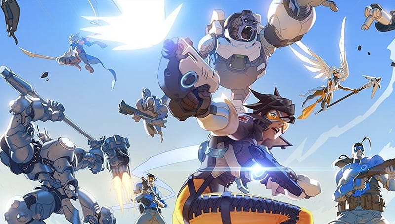
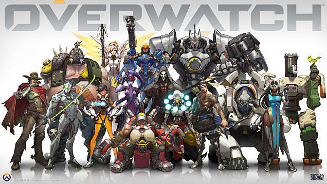
Blizzard is an american company founded in 1991; some of their most known games include warcraft, starcraft and diablo which were their early game that they made in the 90’s and early 00’s and then heartstone and overwatch were only made a few years ago. Blizzard make third person games in a varity of genres untill more recent years where they expanded into first person and card games. They encourage teamwork in the majority of their games, emphersising comunities and competition alike. The games are targeted towards a large demigraphic from 12-30 so has a wide varity of methods of marketing and advertisement from youtube endorcement to even other products like toys.
The games overall have a consistent, cartoon realism / semi realistic art style but each has it own unique, individual spin on the style, for example starcraft 2 is a relatively realistic compared to warcraft which is quite cartoony. Overwatch sits inbetweeen as it’s more like it’s in a comic book style and shares many simierality’s to world of warcaft in characters and environments are design / texturing but with more detail and slightly simpler textures. Violence in these games are quite tame as most are rated low enough for children to play and they often emulate comic book’s lack of gore as part of their style or the few times they do, it’s for effect. The lore is important to overwatch and world of war craft as it will include players who would play heavily story-driven games but it isn’t nessisary to watch cutscenes / animations telling the story as it is still a shooter / MMO.
The developers of Overwatch used an array of strong artistic techniques. Colour is one of the most important elements in Overwatch, Everything is saturated with colour. the characters, in particular, are a great example of this. The villains have strong, bolder and more vivid colours contrasting with black to give a sharp edge to sutaly suggest that they are a villain. On the other hand, hero tend to have a more natural, softer colours giving off a more friendly apperance like blue and beiges. Because of this, it allows players to easily distinguish several things about a character at just a glance.
The other important element of overwatch’s design is Shape, characters generally don’t have too many sharp edges, even the villains have soft edges giving the game a lighter tone. Overwatch also uses preprotion to suggests certain personalities such us Tracer being light and fast as well as Reinhardt being a protector. Standing the silhouettes all the characters side by side, you would be able to distinguish between them through their shape, size and mannerisms. Blizzard has put an emphasis on the individuality of the characters and have been enhanced by the realistic movements, expressions. animations and even human emotions of the characters shows that blizzard is putting thought about the target audience and how it appeals to them.
In since years stylised games have become very popular as video games are consided as art more and more; as realistic video games have been saturated for years. Many games are adopting the trend such as legend of zelda wind waker, inside and bioshock. With the release of Overwatch and other stylised games, the industry started to shift from realism to stylized games and considering games as more of an artform than just entertainment. Me and the wider community finding games have more verity than ever before and this allow the possibility for more unique gameplay mechanics due to the different style.
Designing and Developing character concepts
To start off I struggled to find some concepts for my three characters so I started off by looking at inspiration and images across the internet.
after looking, making and talking to different people I came up with the character concepts: a rescue hero, a murdering robot hero and a disciple of zenyatta hero.
Rescue Hero (S-05/Lotus):
I ultimately decided on this idea of a concept when I looked at the current hero roster and saw what was missing, a hero that saved people from natural disasters. I looked at what different emergency services were using to save people in real life and I found that drones are being used to search for people stuck in rubble etc and I thought it could be a good game mechanic so that’s where I started.
After the idea, I started coming up with the design and the abilities of the drone as such basing it of a stealth bomber or hornet from halo. As the character was apart of the emergency services, I decided that I was against the idea of the drone having any weapons although it could make a good mobile weapons platform so I focused on defensive and utility abilities for the drone. I recently played a game of warhammer 40k with my friends and one of the units of the Tau, one of the playable races in the game, is a shield drone that sacrifices it self in order to protect more valuable things. As I wanted it to be a core part of the character I thought that it constantly respawning would present it as the opposite, a expendable piece of equipment so my alternative was to make the drone expand into a shield like other characters in the game. As I didn’t want the character too be too similar to Reinhardt, I thought of a lotus-styled drone where the drone would open up in front of the rescue hero and expand creating multiple shield petals with their own health bar each so a clever team could focus fire on one petal, allowing them to fire though quickly but this means that the whole shield doesn’t collapse.
My tutour suggested that the character and drone was like a bird handler and their bird so I started looking into where it origenated, other similar thing in different cultures. One culture that stood out to me was mongolian culture as they largely rely on horses and other older forms of transportation some parts of the country so I thought it could be a good place for my character to operate as the difficult, hazardous terrain would mean that any emergency services would be slowed down. Another area I thought would be good for my character to operate is the baltic region as in the lore of overwatch western europe is ruined from the omnic crisis, it got a variety of terrain and ruined building for people to get stuck in etc.
For character design itself, I wanted to make a multi purpose suit that could be used for different environments so they won’t have to change outfit for both lore and game reasons. I knew that the outfit was going to be a bit like a wetsuit as any sort of baggy clothing would be detrimental in the water so my main problem was that I had to create something that would keep the character warm during winter but not make it unberible in the summer. other thing I though about things like equipment and other functions of the outfit. For example, harness to be repelled into an area, scuba gear to go underwater for extended periods of time and heat panel to keep the wearer warm like Spiderman’s suit in the marvel films. Lastly to connect their doctor/ soldier training I gave the character short hair with a braid (A bit like DNA) and a bandage wrapped around their face so show they have been thought many things and to create pity to add to the somber personality
As colour and shape is a very important part of Overwatch. I wanted my character to be an all rounder character so I gave my character an average build but Slightly longer and stockier legs as your legs create more power in the water, in gymnastics etc. Colour-wise my character is blues because of the water and because of their somber personality. The hair and the lights will be orange, yellows and browns to contrast because it shows their good nature, their hope and their youth.
The story of S-05/Lotus would be that she is apart soldier training program from a young child to be apart of the next generation of overwatch but didn’t like the fighting/ training drills of the program, the only thing that kept her going was the other parental-like Overwatch agents. When Overwatch disbanded S-05/Lotus joined rescue effort and wellfare aid in the most devistated areas of the omnic crisis.
Murderous Robot Hero:
I wanted a quite twisted character from the get go to contrast Overwatch’s relativly happy tone. Again another role gap in the roster was a area denial hero so that’s where I started. I thought about what would force you into certain areas as such poison, gas and fire. The last two I thought could be both quite good and I had the idea of using them in conjunction, for example, releasing black gas and lighting it up with a flamethrower so the threat the gas is there but it does no damage until it is ignited.
As i wanted to create a twisted character, I thought it would be good to have a mad scientist who didn’t mind subjecting himself and others to toxic fewmes but later on I thought it was better to twist an onmic or to have a cyborg wanting their human half back. I couldn’t decide between the last two options so I started designing both in mind. I wanted the gas/smoke to be expelling though vents or though a gas mask as I thought that would make an intimidating presence for the character. Another way I wanted to make an intimidating presences was by using a skull as the omnic/cyborg’s head.
I was talk to one of my friend’s about star wars and it made me think of general grievous who is a cyborg and he would be a good inspiration for my character as he is a cyborg and is similarly ruthless in personality. I learnt about a pyroclastic cloud and thought it would be a good fit for my character to spew out as it is a fast-moving current of hot gas and volcanic matter so it would be a pretty terrifimg thing to witness. While I was designing the character I thought it would be good to make it’s armour out of bones as i thought would be cool if it wears the bones of it’s defeated enemies as this will really show scary this character is. This lead me to look at sharmans and a the bull skull that they are known for wearing.
Game play wise, my character is going to be a area denial hero as mentioned before but I want this character to be relisiant and to be a constant threat to the enemy team. So I thought it might be good to passivly heal when the character is in the gas to encourage players to use it’s gas to play character as intended. In case of larger more open areas of level I wanted a ranged ability for the character as some other heros else could snipe him/wear him down before he can fight back so I thought of an ability called afterburner which doubles the range so he reach mid ranged enemies but still but to long range enemies so he still has a weakness.
Like before colour and shape is very important to overwatch, So I wanted to show his personality with fire colours like yellow, orange as well as red and contrast it with charcoal, the warm colour to show his passion and the charcoal to show his evil intent. Shape-wise I want him to be lanky but imposing to make be like a spider to make him creepy as possible.
Disciple of zenyatta hero:
The final character I created for the project, was the most difficult to come up with because when I was brainstorming, looking at gaps in the roster etc, I couldn’t find any gaps I could with my characters so I took a different approuch, adding to an existing character by adding my character into their story. After bouncing some ideas, I found out that Zenyatta used to be in a monk group called the Shambali so I thought of a character that was a disciple of his while they were there. I wanted the disciple to have something different about them to give them a reason to go to the Shambali so I thought of another character, widowmaker which has odd coloured skin so thought it could be a good reason to go.
Design-wise I started with the monk outfit like zenyattas, looking at different outfit monks and other religoes people wear, various robes, garments etc, then I thought of shaolin warrior monks. These monks are renouned for their disaplen but aiern’t surprienly very spritual which I could be a good fits the character wouldn’t be able to see the iris which the shambali believe in, why zenyatta left, as the character is human. Shaolin warrior monk specialise in certain weapon such as staff, axe, hammer, club and sword. The latter, more specifically the plum blossom broadsword I thought would be good fit a good fit between balance and power as well as a good rival to genji as he also went to the temple when he was wounded and was given his cyborg body.
I wasn’t sure on the character as I thought he would be too similar to zenyatta and genji, just being a highbred of the two so I looked at other options. I kept the sword idea but changed the sword to a scimitar when I was looking at different swords as it can look similar to a dao blade. So changed from looking at monks, to looking middle eastern, arabian culture. During my search, I particually looked at Arabic traditional clothing, getting a sense for the style and looking at history or things that they known for.
What stood out to while looking at history was Nizaris. Nizaris is the largest segment of the Ismaili Shi’i Muslims. The Nizari targeted the most powerful enemy leaders faced by these new communities in the Elburz Mountains as they were feared as the Assassins. They killed key political figures to avoid war for their people and was far stronger, in spirit and unquestioning obedience than the average man as they would unhesitatingly take a headlong death dive from castle walls to show sprit to diswade a leader from starting a wars against them so the community could live free from being a vassal to any nation or power.
Gameplay-wise, the character would be a dps character that would do extra damage to a single target, encouraging teamwork to quickly take out key targets. Maybe he could have an ability like the spy from tf2 where he could betend to be enemy players so he could set up an surpise attack or maybe he can climb on walls and blend in with the environment.
Feedback and Poll decision:
After designing my characters for the project, I asked family and friends that know about overwatch a few questions about my designs and any concerns they have with them as I wasn’t able to post online because I was falling behind so I tried to make it as unbiased as possible so I can get fair results.
Most people taking the questionnaire are in the target demographic of overwatch but I feel that there is a wide verity for age groups which I think gave a more accurate opinion as some people might not be as into gaming so won’t presume certain things about the characters.
Most people thought that the concepts fit into Overwatch style/lore but found some concepts stronger than others, particularly the Disciple hero being the weakest which surprisingly people thought that the character fit the theme well. The Robot hero might not have fit the tone as well as the other heroes so I think that’s why it got a lower score on the second question.
Out of my characters the shield drone hero won the most votes. Because I didn’t post it online, I didn’t any useless or jokes comment so all comments were good and relevant. One of my friends was confused with the robot’s shaman mask as it was a bulls skull rather than human as the character wear’s the bones of his victims and so preferred the human skull design variant. My brother found that Zenyatta’s disciple’s outfit was to bland so didn’t stand out as character amongst the roster. It was clear from the comments that the shield drone hero fit in the most with the style and had the most sound design and because of that had the most votes.
Since the questionnaire. I have been striving to improve on the the chosen character by listening to the criticism and acting upon it. I started by practicing faces and face features as that was what I struggled with most last time I made a character which made me lose time in the project previously. I changed the hairstyle because it looked to similar to other heroes in the Overwatch roster.
I put together a simpler design which is less complicated so fits the style of overwatch better as I looked more closely at the designs as well as things like form etc. I’ve been experimenting with the colours and tones of the character, seeing what worked and what didn’t, while keeping it to my aquatic-ish theme.
Making my character model:
Like other times I have made a character, started by making the body using cylinders for the arms, legs and body as well as using a spheres for the breasts. Rather than making the body be the challenge, it’s making it in the same style as Overwatch because of the brief.
Finished off one half of the body and used the symmetry modifier to do the other half. Unlike the last project, I took thought into how many edges I used so it would be easier to join up once I the face and clothing. I’m not sure if the legs are too exaggerated so I might shorten them when everything else is finished.
Next I focused on the face using references like before, using the method is was shown before, tweaking it to suit the Overwatch style. If I had more time would of gone back and changed the lips and maybe the lower parts of the face. I could of save time if I made the ear’s less detailed as they will be partially covered up by her hair.
Here is the point where I started altering the body so that it would become a wetsuit rather than just a body, for example, making the shoulders into built in paldrons. then I focused on the body armour, making by overlaying the body with a plane and going from there.
I finished off the body by adding accessories and making the hair. Ay first I found the hair difficult at first to make as I didn’t know how to approch it but after looking up tutorieles and hard modeling it instead of using the hair and fur modifer, found it a lot easier. The accessories were very easy as I could just extrude them out and alter them.
Unwrapping and Texturing:
The next step is to unwrap my model so I can make my textures etc. My design means that my unwrapping is relatively easy to unwrap compared to my previous project, where I had to unwrap a dress in 3ds max rather than maya as I wasn’t familiar with it.
The unwrapping was overall easy but I had trouble separating the accessories as they aren’t unwrapping properly because I didn’t know where to cut the seams. The hair and eye on the other hand was easy because the eye is a simple shape and the hair I was introduced to handy tool to unwrap it easily and painlessly.
I had an idea of what colours to choose but i wanted to experiment with different colour schemes to see if I prefered alternate colour or shades. Although my overall colour has stayed the same, smaller things like having two shades of blue and the blueish-grey armour.
I spent time perfecting the the texture as I didn’t think it was good leaving it a plain colour because I think it wouldn’t look very good otherwise. I layered different colour, red as the base, light red for the highlights and dark red for the roots.
The texture for the eye can be quite scruffy as it’ll be only seen form far away rather than be viewed this close. I have done a similar thing to make the iris, as with the hair texture I made.
These are the textures for the rest of the body, overwatch texture overall are quite simple comparatively due to the cartoon style so I left them quite simple and because I was running out of time so I needed to get back on track.
Rigging:
I started with the root bone which is the base that you build your rig from, then it’s making the spine going through the center mass from the pelvis to the head then the legs and arms and the end joint. The end joint are important Because they will make sure the orientation of the bones are correct but the joints have to be removed before the skinning process starts.
Painting skin weights is where you select a bone and paint where you want the bone to effect the model. Because of my model, it was relatively easy to find where to paint the weight as I could follow where the bones go rather than have to worry anything sticking off from the body.
To finish off the rigging process It is good to add IK handles as it makes animating easier as they control a leg or an arm rather than a singular bone. I made 6 IK handles, 2 for the arms, two for the legs and two for the clavicle because they are the most important parts of the body, exceptions being the head and the spine. As the head and the spine can bend in all directions, the IK handles find it difficult to work properly.
Evaluation:
At the start of the project we got a brief from four developers, (CD Project Red, Blizzard, Nintendo and Naughty Dog) each with a couple of games to choose from, To design and create a character in the style of the developer’s game. The reason why we were tasked with the project is because it would give us a feel for what it was like to be in the industry, not having complete choice over of what character we get to create as people will vote on what character to create. Out of the developers, I was immediately drawn to CD Project Red and Blizzard as they’re both developer that I like the style of but it was a tough time choosing between the two. In the end I decided on overwatch because I liked the cartoony art style and I thought that you could do alot of things in cyberpunk in overwatch than overwatch in cyberpunk because of the 80’s punk aesthetic style.
I was excited to able to draw in the style of overwatch as I personally really like the style so I started all sorts of research to do with the style and the lore behind the game, learning about the character design, their stories and the overarching story as a whole. I think it was good not just looking overwatch but a wide verity of sources as it allowed me to come up with some interesting concepts that I wouldn’t of otherwise. I particularly liked the Nizaris as they were good inspiration for one of my characters as they had very strong wills and beliefs which fit well into the disciple theme I had for the character. I felt rush to continue to the character design because of the timings of the project so I felt like I was lacking research for one of my designs. I based my research on my ideas so it was focused so I didn’t waste time on things that were irrelevant.
After my research I started drawing and developing my concept my three best designs, that stood out and felt like new, unique characters while still fitting into the Overwatch style. This was one of my favourite parts of part 1 as I like coming up and drawing design but I found It difficult to deside what they looked like, partly as I couldn’t what I wanted to so I couldn’t see if I prefered it. I am happy though I really thought about my three design like their equipment, their story and why they are who their are etc which I think made the design better than they would have been. Some people in the class wanted to get a certain design chosen as they prefered it over their other ones but I was happy with any of the three designs. Because of timing the poll was conducted quite informally and is something I would change definitely if I did this again. As I was happy with all three designs I happy when people voted as I wasn’t hoping for a singular one. S05 won the vote and I think it’s a good choice as I think It fits the most into Overwatch.
When I got to modeling, I was a little bit behind on time so I was very happy when I caught up to the rest of the class as I able to make my model quite fast I have experience making a character from my last project. When I was making my model, it was mostly just hard surface modeling, using references as well as I making sure I wasn’t using too many ploy’s so I didn’t go over the limit. Because of this, I finished the model just over half the poly limit. If I could try this project again, I would similar to before but after I finish the model I would go back and add extra poly’s so when it came to animating it would reduce deformation as it would make the model that much better than before, in the animations.
Up in till recently I have not much experience in Maya so when it came to do the unwrapping and rigging, it was a bit of a learning curve but i’m glad I know as now have more knowledge than before about the program. Another thing I learn about was painting skin weights as before I just thought it was using the capsuals. It took me a while to get the hang of it but i’m happy with the results as I think is was done cleanly and efficiently. The rigging side of it was easy in comparison as I have already rigged a character before but I wasn’t used to maya so it was a little difficult to find tool and commands I need to make the rig. The textures was good although I haven’t had much practice making them and it helps that overwatch has a cartoony art style because it isn’t as hard to create it’s textures than realistic textures. I’m proud of my hair texture as I think it particularly went well as I think I blended the different colours and layers well.
Overall, I think this project was mixed, at some points I am disappointed by my performance as I couldn’t draw what I wanted to which made fall behind but other points like when I made my model immediately after, I partly caught up and only used 6,000 out of the 10,000 poly limit. I am quite happy with what I learn’t this project as it reinforced my knowledge in maya by learning different parts of the modeling process such as painting skin weights as well as the program itself. The main problems I came across was the difficulty of drawing and not knowing maya very well like I mentioned before. The character, S05, I think she links to the aesthetic of overwatch as I looked for gaps in the current roster and thought of what would fill them and as part of the research I looked at what made other characters fit into overwatch as inspiration. I enjoied the project but if I were to try the project again I would focus more on the parts I found difficult and ask for help when I needed to.
Part 2 Introduction:
In the second half of the project I am going to Animate my character that I built in the first half, making walking, run, idle, ranged attack etc animations. After that, the other part of the 2nd half of the project is to design 5 environments and create a working, interactive environment in Unreal Engine using on of the designs. The environment doesn’t have to be in the same style of our chosen game and can be reasonably small. Along side this I am expected to research different game environments to serve as inspiration and good examples of game design.
Level Analysis:
For my first environment that I have chosen to analyse is the map called black forest from overwatch. This is one of Overwatch’s single point control map; it has a large central indoor area and sniping areas in the corners via buildings and walkways. The rest of the map is sparsely covered in fauna, trees, plants etc as the area has been abandoned for quite some time by the start of overwatch.
It inspires me because I am planing on making a secluded area which is out in the middle of nowhere. It has old-non modern architecture that I personally think that would go well in a abandoned place turned into a base for overwatch. In the lore, much of central and eastern europe is decimated; you can see this as their are bodies of broken ominxs’ and buildings. The lighting is dim to emphersise abandoned theme of the map, the same as scale of the map as the buildings are really tall for the type of building they are, another way to show loneliness. Compared to the rest of the game, the map has a very dull colour scheme using greys and browns spicing it up with reds and greens occasionally.
For my second environment, I have chosen the Kamino map from star wars battlefront 2. The map has multiple circlur platforms with multiple pathways connecting each of them. This makes makes lots of sniper spots as well as choke points for the defenders and a lot of flank routes for attackers. The the planet is a sea planet so this is why the map place on a series of platforms and this is the cloning facility for the clones.
Because it’s a cloning facility, the map is very clean and orderly apart of the CIS attack. It uses To continue the theme, the inside is mostly white and since it’s been attacked the outside has blackened, from blaster fire and boarding pods. It inspires me as I might like to make a laboratory or a hidden base so I might like to keep it orderly and layed out to get the same feel as the map. The lighting has large contrast between the bright inside and the dark night of the outside.
Level Design:
Firstly, I thought of having a virtual reality level so the characters have a place to train against each other. My first attempt at drawing the level when rather poorly as it’s hard to distinguish the fore ground from the background. What I do like though is the effect on the laser grid as it looks like it has beams going though it.
This next image runs with the training theme but loses the virtual reality idea instead for a dedicated training room. This time it’s much clearer and is better proportioned than the previous drawing and I started thinking that this would be good as a part of a level than a whole level itself.
This was another intial drawing that didn’t go to well so I stoped halfway before I finished as I knew that I could do better. The drawing was suppose to be a factory and the machine as the focal point.
I tried drawing from a different perspective from on top a balcony looking over the factory but I still wasn’t happy with it but I do like the balcony so i’m going to draw it similarly in my next drawing.
I was alot happier this time drawing the factory as I liked how it’s much more detailed with various object filling the space more while leaving space to move about. I did a little experimentation with a black pen which created a cleaner aesthetic. As there is a similar level in overwatch I am looking at other ideas for my project.
For this idea I wanted to make a treehouse level where multiple platforms were connected to make a level like kashyyyk from star wars. I thought I could make a very vertical map you could be shot from above or below you. The map could get quite complicated particularly the background so I decided against the idea.
I wanted to make a high tech laboratory as it could hint to another hero or could be a story hook for the game. I think This one is the best one so far as it has a bit of a story which gives it a bit more life than the others so far.
This one is suppose to be set in a quarry that goes underground spliting the map into 2 sections first half above ground, second half below ground. This creates opertunies to trap and create choke points for the defending team while still having flank routes for the attacking team.
This was my first attempt to design the layout for the level rather than just the concept art of the level. This was where I learnt about level design further as one of the things I learnt was I needed to separate the layers of the level to properly display them. I like the transition to the underground as it makes a layer of surpise and is unique comparied to real levels. Although I really like this idea I resently thought of another that’s better than this one.
I settled on mixing multiple ideas together and the map became a home base for Overwatch, if it was the game I would make it the hub world where you would take mission, practice skills and upgrade your weapons. I started searching for other inspiration to compliment my designs.
For this idea I was inspired by Asgard from the marvel movies, particularly the architecture as it look like a sci fi-roman city as it could look like they made an old building their base as it was a good disguise so the authorities couldn’t find them, I also think that it would make a combination with sci fi element of Overwatch.
Since, I wanted it to be secluded as at the time Overwatch is illegal and were disbanded year prior, I decided to set the base in the mountains as they make a natural barrier so that people don’t wander in the area. The building would be modified to better suit Overwatch containing quarters, laboratory etc.
This is a floor plan for the base, the drawing is split into two sections the first floor with the ground floor and the second floor. The first floor and ground floor are together because they don’t over lap each other. You start on the helipad next to the command center as the character’s main mode of transport and way of getting in, is the jet they own. Many fans like characters as they are a big part of game so I’ve allowed some space for each character so I put easter eggs, things about their character etc.
This was my first attempt at making my level it was going well until random would start move and break what I already have made, luckily I managed to remember to take a few screenshots before I couldn’t continue anymore. Remaking my level set me back so I made a test to try things before I started again.
Previously, I made my level in 3ds max which made it hard to import to unreal without any difficulties so I decided to start again in unreal this time. I also stopped working so mathematically as I wanted to make the base look more natural as I think it would of looked out of place if I had the old map.
I spent a lot of time landscaping and trying different things, seeing what did work and what didn’t as I wasn’t familiar with the landscaping tool in unreal before this project. After that, I started to block out where everything is because I altered the layout to to suit the terrain as before it was more compact and wouldn’t use all the available space.
I use subtraction block to add detail to the buildings while keeping it simple as I falling behind while scattering few crates etc to make the level feel more lively. I added a bridge so the player navigate to the other side as in Overwatch the character can’t swim in game and also added some support beam for the helipad to make it look more realistic.
Animation:
I’m planing on doing run, idle, jump, fall, land, shoot animations as it covers the basics but allows me to still be on time to submit. During the process i sometimes used the ik blend in the walk animation but for the majority of the time I move all of the bones individually as it gave me more control then using the ik handles but it made me slower.
I ended up having to simplify the animation after making my first idle animation as it would look unnatural as it would loop the character looking at the data pad every few seconds. So I decided to remake another ones which would be a simple breathing animation as the idle as remaking my idle is using time that I could be spending doing something else.
I spent the most time on the walk animation as i had the most difficulty because it was hard to make it flow well. I looked at video of people walking so i could easy see what I could change or alter to make it look better. I got to the point where I was happy with the animation and had to move on else i would make it worse by changing it too much.
My simple shooting animation starts with the firing and the immediate recoil afterwards, then it slowly returns to the firing position. It helped me acting out the animations myself as it gave me a realistic direction for the animation. i found that some of my animations are too slow or fast but that can be easily changed in unreal.
Unreal:
After finishing other parts of my project and finishing my preperations I was finally able to get after jumping ahead of myself a few times when I was missing stuff which was why I took so long to start this part of the project. I started by importing everything I have done that is relivent, arranging them into folder ready to start work.
My first step was to create a animation blueprint alongside a blend space for the animations. The animation blueprint is where I impeliment all of the instructions for the character to follow and the blend space is what the animation blueprint uses to make a smooth transition between animation in the code.
Inside the animation blueprint is the state machine which is where the animation interact and tell each other when to start and stop by filling certain conditions. It start with the entry, which is when the game starts, then immediately puts it on idle/run as i made this the base state where everything loops back to it as it is the most common thing the players will do. I kept my earlier state graph where I accidentally used my animations themselves which obviously didn’t work. Inside each state is my conditions and the blends space, I used direction, speed or a button press as the conditions as their were the trigger for the animation to change from one to another.
The top image was the first code I created for the animation blueprint that worked but I relised i suddenly changed into another animation when it was instructed to as it didn’t use the blend space I already had made earlier. I used guides and helpful websites to improve and help me understand what I was trying to do. My second attempt looked alot better and I think is way more successful as it is simplified and works better than my previous attempt.
The image was another part of the first attempt at my code but from the character blueprint which I modified the template as similarly became unusable once I started recreating my code as I used blend space because it makes smoother transition between the animations.
This last part was to implement my shooting animation for my character. I created a shooting input which was e and I then created the top image so when it was pressed it would play the animation but turn off again afterwards. Finally, I went into the state animation and set up my conditions for my idle/run to transition into the shooting animation.
Evaluation:
Over the course for the project, I was tasked with creating a character for the game, Overwatch as well as a level for the character to roam in. This character had to be designed, modeled, textured, rigged, animated, then put into unreal and make codes for the character to be playable in the level that I have made. My idea for my character came from what was missing, a hero that saved people from natural disasters as most of the characters have some sort of military background as Overwatch was made to stop the Onmic invasion. It was soon implemented that they would use a drone to search for survivors which I have based my characters abilities on. After making to other concepts I asked people on their opinions and most people agreed that this was the best concept as it fit best into the game as my other character were more risky and outlandish.
I think some things have gone quite well, for example I think my designs have been quite fluid, developing quite naturally from beginning to end. I’m happy with the modeling as it really fits in with the style of Overwatch while still being a comfortable amount of polys, easily able to add more without any worry. My textures are passable and the texture for the character’s hair is the best texture by far. Rigging and animating went well, I rigged my character very fast compared to my last character that I made, the exception was painting the skin weight as I never have done before which I now understand better. Animating took me a while to get into the swing of thing but once I turn off ik blends, it was much easier as it was much for methodical than before. When I moved on to unreal, this was when thing became unfamiliar territory as people preferred to have lesson on coursework or other things so I had more of a learning curve than in previous areas but it suddenly click during nearer the end of the project which made things much easier. My level got better with persistence and I got help and improved my coding skills, both giving me a better understanding through different methods.
This project The first half was improving on my skills as I have had some practice in these areas before in previous projects and lessons. The second half of the project on the other hand, provided a much more interesting, challenging obstacle to overcome. To start with I learnt some of the more advanced stuff of rigging in particular skin weights before I had them automatically generated so I spent a long time perfecting them so my animations look better when I got to them. Unreal is where I learnt the most in the project as this is where I was the most clueless in and so I struggled getting the hang of coding in particular as everything is in difficult to find places and not knowing all the different commands which could of help me earlier. The level was a bit easier as it is mostly on one area so I spent some time just getting used to the different thing that you could do such as landscaping.
I have been solving problems alongside as the project went on, these varied from small to large, from simply forgetting to tick a box to spending ageing fixing animation problems. Some of the most notable problems have been, some of the animations refusing to key when I moved it into position, I remove some of the skin weights so I could paint it under a different bone but it cause the mesh to fly off, my code not using the blend space I created and importing my assets as I didn’t use the correct settings. I found that it was easier to solve a problem after taking a step back and thinking what I want the outcome to be and how to get there.
Although I am happy with the project overall, their is some areas where I think they could be better. Texturing is the first thing I found frustrating as I find it not quite as exciting as other areas. I found visualizing the deformed net of my character hard so it isn’t the most fun when struggling to paint a texture that is quite simple. I was eager to try stuff I had never tried before such as rigging, animation and unreal so I wanted to get better at it but now I think I could do better now as I know more. I was falling behind when I started part 2 of the project so I fell I could of been more careful which is something i’m going to have to improve for FMP.
Because i’m still learning and improving I wouldn’t consider my work to be up to a professional standard but I do think I am improving as I made my character model easier and under 10k polys. Textures I feel are my weakest part of my project but my rigging is decent as I think I did well on my skin weights, with minor stretching. Some of my animations I think is on par with my skill level but some I had to do with an time limit in mind as it was near to the end of the project. Because of time constants I think I could of made it on par if I had the time to change and improve upon what I have already made. Because I had to just make a whitebox where I think I would have to finish making the level by adding detail and insides. Since this is the first time I properly used unreal so there is probably easier or better way of doing things.
If I was to attempt a similar project again I would a few things differently such as keep on time with a schedule or target while give me a little bit of slack just in case if anything happens. I would separate the hair from the character as it made it difficult to make textures and I would make the textures in the same style as Overwatch. Since I have learnt alot from my time since I started I think I would of approach the project differently but I am happy as it was more enjoyable than I thought as it allowed more freedom than I originally thought and it gave me a good foundation for my FMP.
In this induction project I intend to make a 2D piece of digital artwork with the theme of flow. The theme is quite open so I am able to interpret it how I want to interpret it to suit the project to what I would like to do. Flow to me can mean many different things, the obvious one is the flow of water, currents and waterfalls etc but i decided instead to focus on flow of time More specifically the flow of events. I am also having a look and explore at different media to see if their are other ways to interpret flow.
Research:
In my research i am hoping to find different insparaion for my project so i can a feel for what it might like when it comes to designing. Before I started my research, I decided to make a mind map to find what direction i’m going in and to start thinking about what my piece will be like.
(mind map)
With my mind map I started to like the idea of painting a bird and maybe multiple positions during it’s flight. I also wanted to explore time and water as other components to my piece.
Zachary Flynt
I have found an artist called zachary flynt and he specialises in water colour paintings. the media choice in particular is why I was interested in his work and who the water colour is quite pale in the majority of the piece then having bold colour to draw you to the focal point.
James Cameron’s Avatar (banshees)
This is some concept art from James Cameron’s avatar, it was for the design of the banshees and for the ceremony taming scene. I wanted to look at alien creatures if i wanted my bird to be real or fictional and i think the pattern and shapes is a cool idea to add to my piece.
PS Delux
PS Delux is a hobby artist on artstation who draws/paints different animals and people. I chose them because I like the line work in all of their pieces and how the extend past as well as how it also marks things like wing span and other planing marks.
Design:
While looking at different websites and videos for my research, I have found that I like the idea of painting a bird and I also wanted to use water colours for my piece as it compliments the theme. I decided that it would be a good to base my project on multiple images of a bird, showing a string of events.
(first sketch)
In the begining I wanted to paint a brown falcon so my first sketch is based on it and then i tried different positions in flight. After my initial sketches I decided to paint a raven over the falcon and other birds as I found it could be another way to relate to flow. Ravens are known to savenge battlefields and feed on the dead which to some would consider to be cold. this also relates ice inturn water.
(second sketch)
The second time I was much more successful as the beak is in a better shape and the eye were in a better position. Another thing that was improved was the legs as they were too small and their wasn’t enough feathers on the upper half of the legs. I decided to use this image as a base for my final piece and build on top of this.
final piece
I started by using my best sketch as my template for my final piece, I traced over the sketch, creating an outline with a white edge and blocking out the basic colours.
Next I added singular shards on the wing to be like feathers and started experimenting with basic detail and colours. I tried to define the edges more by brightening the colour up and using colour to compliment it.
I changed my first attempt at shading and detail by smudging the detail to get the form for the next attempt. I used colour to show the light going though the ice.
I finished it off by by doing the same as before on the tail and legs. This is the finish asset for the project.
Evaluation:
Overall I think I have done pretty well as we had 2 weeks to do this. For the research found some interesting artists but I think it would be better if I had more varied sources. For my designs I already had the idea that I was going to paint a bird, it was more to decided what it would look like and colour etc. Next time I will develop my ideas a bit more as I will have more time to flesh out my ideas and improve upon them.
For the final project of the year we have to make a brief by myself instead of my tutors having one for me to do. This entails me making creating my own concept for a character to then use to create a 3D model. The project will last for 12 weeks or 15 if the holidays are included. To support my work I will be researching different techniques and artists to influence and improve my work.
Task 1:
For task 1, our group needed to make project proposal so that we understand what we are doing and if it’s can be done in the time frame.
Task 2:
In task 2 I have to come up with different initial ideas for my final project explore them in different ways to help me decide on what I would like to do specifically for my final project for the year.
Initially, I already had a few ideas in mind ideas such as a vigilante, a knight and a gang member / criminal. Here is a mind map on what sort of character I would like to do.
My first idea is a knight; I have been wanting to make a knight for while so it was one of my first ideas. I wasn’t sure on what type of knight I would like to make, a classic knight from fairytales and real life or to go with a modern fantasy (literature, games, movies) as the oldern perspective has a more realistic armour based on what they expect a knight to look like and how they preceve a knight to be. On the other hand, the more modern view of a knight is a lot more varied as the different media from a dark knight with lots of spikes to futuristic version with neon lights and sword. I liked the idea of the neon knight but I preferred a more realistic knight. I started drawing different parts of the armour to see which I like best. after this I decided to draw the knight as a whole.
I started by drawing different types of helmet, most with visors as I prefer the look of enclosed helmets and I even have a knight helmet made in the future. I have also drawn a few shoulder pads which could both be made out of leather or metal depending on what sort of knight I would want to do. At the bottom I have a quick sckech of a shield and it’s crest.
I have drawn another helmet which is like the one before but at a different angle to see how it looked like in a different perspective. Then I moved one to different parts of armour such as the gauntlets, chest and knee guards. The gauntlets would be quite simple with many parts for articulation apart from one design which prevent individual fingers from moving. The knee guards are standard for a knight but the breast plates are not because they are made out of parts and have large gaps in the armour.
This is my first idea on what my knight would look like altogether, mostly with metal plates but with chainmail and leather/gambeson material. The metal plate are quite often overlapped as I like the idea of it and it help when it comes to the knights movement. I have drawn a gambeson down to the knees as to cover weaker joints and looked horrible without.
This leads me to my first tutorial which is me learning how to paint metal and how reflections work. Jesus Conde is the person that created the tutorial and has other useful videos like this one.
I started out by blocking out the main colours to find out where the light would come from and where the shading would be for this plate of some armour. This is painted quite loosly as I am not sure about just painting one plate.
I completely redone the entire arm as I didn’t like the singular plate as it looked too much like a square. I have done what I have previously have said but I have also started shading and reflections from the ground and sky.
I got rid of the hard outlines, thined the sky reflection and enlarged the ground reflection to emphasise them. I have also made the armour more blue as metal is very reflective of it suroundings so I also darkened the green for the same reason.
My second idea is a vigilante, this was something I could go any direction with, which I like as it allows me to have total freedom. the first idea I had about the vigilanty is that they use a mask to strike fear into the hearts of criminals. They could be ex military and would be experience in the field of combat. This would lead to a practical outfit design with guns being the most common weapon that they would use. They could have a dark skeurwed perception on the world which could contrast the bright lights of the city. This would be because of an event of some sorts, this could manifest into they design via scars or a keep sake. This vigilante could also be less pessimistic so could be more like a superhero using non-lethal weapons which would change their design quite a bit.
I like the idea of the vigilante wearing swat like clothing so I have drawn a tactical vest with a radio and other compartments. There are different types of visors to see what shape I like and if I like decals on the visor or the mask in general. I have drawn other things like a pair of trousers and boots.
My next page has some military overalls to continue with the swat theme which are basic overalls with a singular pocket. Then I have drawn a verity of different accessories like a futuristic communicator and a retractable wrist blade. There are standard weapons being a knife and a pistol, the pistol is futuristic firing plasma and the knife is a traditional staple. The glove has a metal plate for protection and a backpack for storage.
I wanted the vigilante to have a fear factor in his design so he is wearing a gas mask with a teeth decal so he looks inhuman. He is wearing a very practical uniform-like outfit for obvious reasons like protection. He has plates on his arms for further protection and he has a hybrid gun for all sorts of situations. He also has a harness for scaling building etc.
My third and final idea was a gang member / criminal which developed from the vigilante as I like the idea of a person outside of the law. Since it developed from a previous idea it is also a modern design but rather than a practical outfit I would think the character would wear casual clothes because I would show weakness and they wouldn’t be able to blend in if they had tactical gear and armour. This works well with a daring personality as you have to be confident when being a gang member / criminal. This leads me to tattoos which could be a gang tattoo to show loyalty to the gang which be another sign of a daring personality. The clothes depending on the person could be flamboyant with the wealth they gathered. The gang member / criminal could use a holiday or festival as a twisted representation of a belief or good nature. an alternative to the gang member / criminal could be a crimelord this crimelord would dress smartly or more regal than the standard gang member / criminal. I have also dabbled in the idea of supernatural powers depending on what type of criminal their are.
For the gangster/criminal I have drawn a track suit as it’s a comfortable outfit and it is quite common so is inconspicuous. I had a go at drawing a pose for this character as I feel it is more important than before because of the relaxed personality of the character compared to the other two. I also had a go at drawing a cartoon tattoo but as it was a cartoon tattoo it didn’t fit well.
My next page is full of more traditionally gangster clothes like a bandana and jewelry as they show power as they can show wealth without being worried about it. I have drawn other things like a hat, pistol and duffle bag but I also have drawn a tag/logo which I think is quite cool as I could see it being a sign for a gang.
This character concept is supost to be scary/itimindating because his face is hidden and his gang tattoo is feared among the local population. He has black jogging bottoms and a vest-like jumper which is basic to make you focus on other parts of the design like the helmet. The helmet has a red slit running down the face to make him look like a alien to scare people.
this lead me to the ideas of practising painting a tattoo on photoshop
The idea was to have a glow in the dark tattoo so I thought it would look cool if it was a skull so it looked like an x-ray when in the dark. So firstly I quickly sketched a face and painted the outline of the skull with it filled in. I also painted the lips so it looked like teeth as I liked just the bone being painted.
I added a skin colour on the face as well as painting a arm for a tattoo. The tattoo is a green snake which is slivering down his arm and this could be a symbol for a gang that he could belong to. I kept it block colours to see what a cartoon style would look like on this type of character and I think it look interesting but I am not sure on whether I would use it for my final concept.
After my initial ideas I start to look in what direction I would like to go in so I looked at inspiration for the different ideas that I have come up with so far. I decided to focus on the classic knight, dark vigilante and crime lord. To do this I have assembled different moodboards for the different ideas I’m work I like the Idea of.
My first moodboard is of the classic knight idea. These knights are all quite heavily armoured, with full metal plates. Quite a few images are painted by Conor Burke which are all semi-realistic with a second material for maneuverability in the joints. The dark souls series is a large infulense on the possible design of the knight.
My next moodboard is for the vigilante, the idea is to have military styled clothes or similarly practical clothing. The images are all from different artists and series so I have a wide verity of influences for my possible vigilante. the two routes I might go down are the assassin route with coat and sniper rifle or a traditional military outfit with tactical vest and backpack.
This moodboard is for the gangster/ crime lord. I have different images for both the gangster and the crime lord. The gangster has causal clothes, tattoos across the arms and accessory all around. The crime lord has a suit or has extravagant and expensive clothes. Like the vigilante, this has no recurring influences as they are all from different things.
After looking at different concepts I have chosen to continue with the crimelord idea.
Task 3:
For task 3 i am going to research all sort of different things to improve and influence my work for my final project.
London
My extended diploma group went to London for two days on the Thursday 7th and Friday 8th of February to look at a games exhibition in Victoria and Albert Museum, as well as other museums in the area. Proceeding a long journey to London we made our way to the Premier Inn where we would be staying. After stopping for lunch we headed towards he national history museum. in the museum, we went round at our leisure, taking photos at the different exhibits as we went along. some of my favourite things in the museum was the different ores in the museum as there was all sorts of different and bright colours and the dinosaur’s/ mammal sections as I liked looking at the bones and painting in the different areas. We headed back for the night after visiting the museum.
The next day we got up and had breakfast, then we went to the Victoria and Albert Museum to go to the games exhibition. This was my favourite part as it was the most relevant part to the course. In the first section there was all sorts of different concept art and different processes during the development of game. I particularly like the splatoon concept art and the dark souls concept art. in the next section was a huge curved projection which showed an interesting documentary about game featuring such games as EVE online, Overwatch and Minecraft. In the third and final room there was lots of arcade machines and other really simple but addictive games such as a game where you are a taxi driver and you have to deliver people to there destinations. there was another game where you used a joystick to control a dot that goes up a glowing line and you have to make sure that it reaches end without getting destroyed by red dots along the way. We then exited the game exhibition into the rest of the museum. There wasn’t much time so I only looked at the middle east section which was rather interesting. The last museum we when to was the science museum, there was all sorts of machinery such as large space rockets hanging from the ceiling and things such as aeroplanes as well. There was also minifigure representing rocket launch sites etc. we weren’t able to see the rest as we had to go.
Anatomical model
For my practise run I have decided to create a peasant from totally accurate battle simulator. I started by making the chest first by using a reference for a basic body to be accurate. Secondly, create a cylinder around the size of the chest then convert it to editable poly. after that I started to scale and move the different sections in both views to start forming a basic chest shape.
Next to create a simple leg out of a cylinder, by using refences it makes making the arm easier as it allows models to be more accurate. First off we need to have a basic shape to work off so I chose a cylinder with 6 sides, then I would move them and shaping them to key points on the leg. I would add detail by using vertex selection to position them where the muscles in the leg were and then did the same for the other views (as the refences are in line) so the leg would be accurate with all sides.
After I have made the basic chest shape I added more sections with the connect tool to add more detail by working on the different muscles on the chest, moving them around to where the different muscles are. I also made the pelvis by removing some of the vertices and move them around to create a curve shaped as well as a head made from a simple box and altering the vertices to make a oblong shape.
I made the basic arm shape then I would move them and shaping them to key points on the arm like the wrist and shoulder. I would add detail by using vertex selection to position them where the muscles in the arm were and then did the same for the other views so the arm would be accurate with all sides. I altered the head shape with vertices and created the eye by resizing and extruding a cylinder.
I finished the modelling off by adding a stump for a hand. I then used the symmetry modifier to copy the one side to the other so I wouldn’t have to make it myself. I collapses my modifier stack so that there isn’t symmetry anymore and coloured the tabs man red the finish the simple look.
skinning, rigging, hair/ fur, cloth mat
Research anaylsis
Since I decided on a
analyse (6x):
1. de los muertos
Since I had a go at painting face paint on a gangster/crimelord I thought it would be cool to make a character inspired by the de los Muertos festival. De los Muertos is a Mexican holiday celebrated throughout Mexico and is a multi-day holiday focusing on gatherings of family and friends to pray for and remember friends and family members who have died, and help support their spiritual journey. This has been going on for hundreds of years, from early civilization. In the Mexican culture death is viewed has a natural part of the human cycle. They view it has a day of celebration, they believe their loved ones awake and celebrate with them. They don’t view it as a day of sadness but as a day of celebration.
The reason Why I choose this festival is because of the decorations and general aesthetic of the festival as they visit the cemeteries where their loved ones are buried and decorate their graves with ofrendas altars with patterned skull (sugar skulls), flowers, incense etc. They also dress up with face paint and traditional clothes to go in parades or gatherings. The clothes/decorations, particularly sugar skulls, display colourful designs to represent the vitality and individual personality of the departed which I personally like the look of. Another thing I like the look of is the different patterns used in the festival which looks similar to henna.
2. Maria Dimova
I found this piece while researching de los Muertos, for one of these research posts and this is made by Maria Dimova in 2017 for a event catering service called Spanglish asadero. I like the colour and how to is relevant to what I am doing because I am creating a de los Muertos styled character for my project.
It’s most obvious strength is it’s colour throughout the image as it has a range of different hues. The hues represent the smoke in the background and bright splotches representing embers and adding to the bold colours. The colour scheme is like a tropical rainforest with most of the colours are on the flowers. Most of the line work is hidden as it is shaded into the background or into each other but you can tell how good the use of the digital paint throughout the piece. There are a lot of different shapes because of the patterns on the face using semi circles around the eye and tear drops next to the nose. There is also a lot of organic shapes like the free flowing hair or the faint smoke. Tone is the second strongest element in this piece as there is a fire behind the person to show the cooking of meat, so there is a drast contrast between the light and dark areas of the image. The face and hair both have very smooth textures and mono-coloured where as the flowers, in particular are very ruff and multicoloured in comparison.
3. José Guadalupe Posada
When looking at the festival de los Muertos I also found a man called José Guadalupe Posada, he was a Mexican printmaker, cartoon illustrator and lithographer. he used his illustrations to make political and cultural critiques. In particular, he used skulls, calaveras, and bones in his work to make these statements. Some of his works include Calavera Maderista and Gran calavera eléctrica
One of these illustrations, made in 1910–1913, was Calavera Catrina which was suppose to offer a satirical portrait of those Mexican natives who, Posada felt, were aspiring to adopt European aristocratic traditions. The image depicts a female skeleton dressed only in a hat and is related to European styles of the early 20th century. The original leaflet describes a person who was ashamed of their indigenous origins and dressed imitating the French style while wearing lots of makeup to make their skin look whiter, this is represented by the bones of the skeleton as bone is white (obivously) and the european-styled hat. But nowadays Calavera Catrina has become an icon of de los Muertos.
The two most prominent things about Calavera Catrina, it’s line work and it’s simplicity. It lines are made from ink as it was in newspapers and is very detailed for the time it was published as cartoon-like characters weren’t common. It has a very organic shape as it features a lot of organic parts such as a human skeleton, flowers and feathers but their an exception being the hat being a semi circle. It uses doesn’t use colour as it’s in 1910-1913 and coloured newspapers weren’t invented yet. Instead he use a clever but simple use of tone to clearly show the shades and materials of the different areas.
4. Nier : Automata
I have found concept art of 2b a character from Nier: Automata. Nier: Automata is an action role-playing game developed by PlatinumGames and published by Square Enix in 2017. The character designer is Akihiko Yoshida, he has made characters from final fantasy and bravely default.
Its strong use of lines is good because it uses the lines to suggest light/reflections on the dress as well as showing folds and shapes on the dress and other places like the gloves. The design for his character are all monotone as he draws them in a comic/anime art style, yet is still able to show brightness and create tints in his piece. Because he kept it monotone it gives the character its striking visuals and it creates contrast on the clothes. As it is in a comic bookstyle it uses the charcters position to create the illsusion of the character being 3D rather than using other objects to put the character into the 3D background (Composition). Because of the use of the lines, it also gives off a smooth shiny texture and if he didn’t it would make the character look flat rather than 3D. As I said before as concept art for a character, it focuses on just the designs so removes any idea of a background, meaning no composition.
5. Ina Wong
Ina Wong is a freelance digital painter and I have found one of her piece called the lotus which was made 2 years ago. She has made many different characters and covers for people or of fun such as KARA and Kal and Syl (two characters in one image). But for this particular image I find that the patterns and lighting are two strong element in the design. It might influence my dress design for my character as well as the colour palette of my character.
The piece’s brush strokes are great because you can see where everything starts through the flow of the piece such as light going through the window and onto her shoulder represented through the shadows from the window frame and the highlights on her neck. There lots of small shapes making the seat and patterns on her leggings but there’s also many organic shapes like her hair and dress. The colour scheme is very royal-like as there is gold and red as the primary colours of the image. In the painting you can clearly see the different tone as she in a shaded room with light shining in through the window. The character takes up the most space with the outside being the background and the flowers in the foreground. The texture of the dress is amazing as it almost looks like glitter and then further down it’s fluffy, almost floaty. The image has a nice composition as the room has some symmetry and the piece is split into thirds through the two pillars as well as making the character the main focus.
6. Spock Star Trek
I resently watched the first star trek film the other day and I saw Spock’s ability to mind meld and it was similar to what my character’s ability is. The film was made in 2009 by J. J. Abrams and is owned by Viacom. J.J. Abrams has also made star wars the force awakens and mission impossible fallout. It will influence me about how my character’s powers work and other interesting possibilities.
It uses thick outlines to give a graphic look and uses smaller horizontal line to show light and tone throughout parts of the face and shirt. It uses lots of shapes, like it’s layered on top of each other to create a interesting piece. The image uses a lot a few strong bold colour’s to create an impact as it is based on a presidentcial poster for Obama. It uses colours as it’s main source of tone using clear changes of colour and gradient to represent shade. It uses the tone to create 3d image by layering parts on top of each other. It looks very flat as it is mostly matte by it does have a bit of texture by using the stripes of colour. I has a very simple compersition as it’s recreating the presidentcial poster which is trying to be eye catching rather than be complicated.
Task 4:
In this task you will see my revised look on my concept and how it develops from the initial concept.
I decided that I like the idea of the theme of de los Muertos since I practiced on my photoshop skill with a basic skull face for the criminal so I already had an idea on what the face might look like. As I wanted a sort of skull girl design, I looked at different patterns to inspire my own. I ended up with a simple design as I wanted this character to be in a semi realistic style.
These were my first ideas on what my character’s outfit would look like, on the left I wanted to make a design with the criminal idea I had previsously came up with. The ideas to have causual clothes but with a patterned shirt veil on top so I can include more pattern to suit the theme. The other design is a styled dress based on the historical dress that would be used for the festival, particularly the frills on the bottom of the dress.
This was a few extra additions for the second dress as I didn’t like the top half of the dress as much so I had redrawn the front and added the back of the dress. I also added patterns on the dress so it would flow better and in turn makes it look better. I ran with the idea by see if the patterns look good as tattoos/tattoo sleeves as it goes with the criminal theme. The patterns are just variations of the previous design to create a theme for the character.
These are the next two designs that I came up with is a petal dress and a Chinese styled dress. the petal I thought was quite cool as in the festival, they uses flower so it will be cool as a part of the dress which would overlap itself with petals to make it look like a flower. On the other side, the dress is supposed to be simple and more practical than some of the other dress as I forgot that I would still like to be into some sort of criminal activity.
For this next design, I wanted to see if the patterns looked good on trousers or other bits of clothing, although it looks good, my next design is a design I prefer but I think this fits a bit better in context of the character. This design is my favourite so far as I like the trim and the patterns across the shoulders down onto the arms but I found that it looked too much like what figure skater’s outfits look like sometimes.
I liked the idea of the previous design so I have redrawn it with slight alterations, mainly having no sleeve. I also had the idea of having a detached sleeve which could be like a long glove or could be a tattoo sleeve of some sort. above is another possible design for the tattoo/sleeve with the flower and with its small petals
This image has accessories/footwear that could be apart of my character’s design, I wasn’t sure how formal should the foot wear be as it might not be practical to have certain types of shoes like heels but it’s commonly use with a dress in de los Muertos as an outfit. I also have drawn a holster which would be hidden by the dress but it wouldn’t work very well in hind sight.
I like this has a posible pattern for a tattoo and a pattern for the dress which would continue with random pattern, movement and rotation. was thinking it would be quite for it to be purple as I think it would compliment the rest of the design nicely.
Earlier I was concerned about the practicality of the footwear of my character so I decided to draw a trainer which I think fits a bit better than other footwear. I was thinking of adding some shoelaces as it would add a bit more to the design.
The next thing I decided to develop was the hairstyles as I haven’t thought about it until now. The top one is a short/medium length hairstyle and the bottom is long hair tied up into a ponytail. I like both of these designs but I think they would suit another character, rather than this one as I think I would like a longer hair style on my character.
Since I mentioned before I preferred the idea of a longer haired character, I have since drawn a basic outline of what I might want it to look like for my character.
Task 5:
final piece plan
I started out by drawing the outline of the character and the dress to make sure proportions are correct etc. I also put some markers on the face so when I go to draw it, it will be easier than before. I haven’t drawn the second arm as I can copy it to the other side when I have finished the first one.
Next I started by drawing the face separately in a sketchbook, importing it over onto photoshop and placing it correctly on the head. Then I blocked out the main colours on the character, ready for it to be painted. I also have a different colour for the inside of the dress to represent shade.
At this point I started focusing on the face and head. I have completely covered the face with face paint for the sugar skull aesthetic and started to shade the face with a light gray as the face is white. I have blocked out the basic hair shape ready to be shaded and tinted as well as painting the eye and shading the eye green.
I forgot to mention before that I also made a flower in her hair to continue with the theme and started to shade it with a slightly pinkish red. Next, I went back to the face and paint the mouth and other patterns like petals, vines and dots. I have started to add detail to the dress like light reflections and the flaps of the dress.
Since the last save I have remove the outline as I have made it less cartoony but still in a semi realistic style I continued adding to the detail on the dress so that the whole dress is darker or lighter depending on where the light is hitting the dress and where is being shaded by other parts of the dress.
I altered the knees as one was off to the right and a bit too high. The dress has been loosened around the chest area as it was a bit tight in hindsight and I have continued to develop the shading, specially around the flaps for the dress as they are starting to look like what their supposed to look like. I also added a petal pattern to add more colour to the character as she was looking too plain for a character based on a colourful festival.
I have added shading on the arms and legs to darken the skin tone as it was too pale before. Next I tried painting both a pair of heels and a pair of trainers to see which one I like better as I wasn’t sure on what looked better. I chopped some of the feet of so the feet wouldn’t run through the trainers.
I have chosen to go with the trainers as I like the idea of the slight informality of the trainer rather than the standard of the high heels. I have added a few details to the trainers like golden rings for the shoelace to go into. I also have painted a pattern to the top half of the dress in a bronze.
I decided to look at different patterns to go on the dress as I haven’t explored my options as much as other areas. Firstly I have a pattern which expands across the stomach that defines the stomach line and adds shape to it. Another pattern also is on the stomach but stops halfway and whirls round the sides.
Another set of patterns I tried were ones that extend from the waist to the armpits and is two whirls that go in opposite direction as I thought that was an interesting idea. I also started another pattern that goes from the neck down, then splitting off as I liked the idea that it ran down from the face onto the dress.
I have just been adding the finishing touches like adding a shadow, brightening the bronze patterns and smoothing the shading, particularly on the arms and tattoo. I decided to just have the original pattern as I wanted to keep it simple as I think it would be too much if I included anything else.
Task 6:
final piece
I started by using my refences that I made to guide the initial shape of the body. As my character is a woman the structure of the body is slightly different but the same overall. Like the tabs man I used the resize and move tools to position the vertices/lines. I also created the neck at an angle so that would flow into the head better.
Similar to the chest I made the arms and legs by resizing and move vertices/lines from a cylinder to show key points on the limbs like the wrist, elbow and shoulder as well as the thigh, knee and ankle. I have left an extrusion where the foot would be so have a starting point for the foot.
At this point I have almost finished making the body by adding feet, a hand and added breasts. I extruded the starting point for the foot so I have a nice curved shape but I don’t have to add toes or the under arch as the character will have shoes. I used two semi circles and extruded them into the chest to make the breasts and I created a box, moved the vertices in place and extruded to make the hand.
Now that I basically made the body I move onto the face. I started by Making the eyes and expanding from there to the nose bridge. Then the extruded down varying the size and curving the shape as I went along. I continued down to the tip of the nose adjusting along the way , then extruding inward for the nostrils and expanding around the nose to create the correct shape. I did a similar thing to the lips rather than the nose, then connected the eye to the nose and lips, so it would create the cheeks. Finally I extruded outward to continue the shape to make the chin, side and top of the head.
I replicated the hand on to the other side by detaching the hand, then mirroring it and the reattaching both back on. I imported the head from before so that I can attach it to the body; I also created a ear for the head by making the edge of the ear and ear lope first, then moving inward. I had to alter the neck and head so that they had the same amount of vertices so they would both fit together.
I completely remodelled the head but the lips and attach it to the body again. I improved it by improving the topology to make it flow better around the face which made the face less flat overall. I changed the head shape as it was odd so now the top of the head is smoother and the back is more rounded.
To finish off the body, I added knees and elbows by bevelling out a few faces and rounding them out. Next I improved the hands by adding fingernails through extruding them out, I also added knuckles by bevelling and rounding. finally I bent the thumb downward as thumbs aren’t as straight as fingers.
After I finished the body I move on to the rig for the body for animation. To start off, I created bones going up like a spine, another going the arm and one more down the leg. I used the body for positioning for the bones so they would fit the model. Once the bones are in place I made the spine a parent and the arms and legs a child. After that I created to the shoulder and wrist and then at the hip and ankle. I finally modified much would move and how strong the pull was so it looked more natural.
Next I moved on to the dress, I started by creating a outline for the dress and when I was happy with it I copied it over to use the break button. I moved one of the panels so it was behind the person and turned it around. Then I used the seam function leaving holes for the head, arm and legs. After that I used the cloth modifier with the satin setting, then started the simulation so the panel come together and wrap around the model.
I made the hair using the hair and fur modifier and creating a separate scalp so the hair goes through the original scalp. I lengthened the hair into an afro then shrunk the styling circle and selected certain parts of the hair and style them individually. If I found that I there was too much hair I simply cut the hair shorter or moved the roof to cover bold patches.
I was experimenting with the cloth modifier to see if the dress look better with different materials and I found that if I use the silk then satin it looks much better. At this point the dress hasn’t seamed properly so I put a edit poly on the dress and target wielded them together. I also deleted some face around the neck to make a nice circle as well as making a hole on the chest to break up the dress.
Although the previous dress was good, it wasn’t like my dress that was inspired by the day of the dead so I added lines before using garment maker and then used force to push them together. Because I had to change the hem of the dress I had to redo the whole of the dress, redoing the steps before.
The last two things I had to do was to unwrap and add textures to my model. I started the unwrap by adding seams then using the quick peel as well as reset peel. The quick peel unwraps it into a net and the reset peel changes the quick peel into a better shape for the object. after that I save the images as a PNG then moving them to photoshop to paint over the uvw maps. Some of these textures went better than others as the skin I could just cover the model and was successful but the face paint i was going to make i struggled to get the look i wanted so I decided to leave the face texture out of the final piece. I used gradients to overlap each other to create the silk effect for my dress to finish off the model.
Here is the final render of the model with all the textures and piece of the model.
evaluation
The theme for this project was terra incognita which means unknown lands and a knew I wanted to make a character very early on so I explored different ideas and settle on a character with unknown powers called Calavera Katrina. My initial concepts were a wandering knight searching for something unknown, a vilgilante with an unknown backstory and a crimelord with unknown powers. I decised to develop these ideas in particular as they interested me the most as I was the most invest in these ideas rather than rather others. Over the course of the project I have researched lot of different things to help on my project even before settling on an idea, I looked at metal reflection just in case if I decieded to choose the knight. I also looked at thing such as how to make ears bodies, faces, a rig, a dress; textures like silk and things like movies, games, festivials, artist and newspapers to influnce and inspire my research. Some of the most important processes I used to make my character were shading, edit poly, garment maker and cloth modifier. Shading was important to realise my design of my character, else they would look flat and 2d. Edit poly, garment maker and cloth modifier was what I mainly used to make the model, garment maker and cloth for the dress and edit poly for everything.
The concept to me was about the character and her powers and regardless of them she doesn’t give into temtation etc. I found using photoshop and 3ds max overall good. In photoshop I mostly developed already existing skills rather than learning new ones. In 3ds max on the other hand, I have learnt many new skills so I have had more trouble with the skills on 3ds max, than on photoshop. I am pleased if the piece I have made for the project as I have learnt and improved on different skills and I can see how I improve from my last project but I would be more pleased if it was more accurate to the design I made in photoshop but the person looks quite good so I am happy overall.
Some of the problems were me redoing parts of work I have already done as they weren’t to my standard such as redoing the face, dress and hands. Rigging was a bit of trouble because I never done it before and I wasn’t used to maya as I haven’t used it a lot. Because I was using maya I also had with converting it to 3ds max as it wasn’t liking what I was doing. For my project I thought I managed my time well I just had difficulty with my final piece so it took longer than I expected it to. Since I spent so long rdoing different parts to my standard and I made sure my work was organised, I feel that my work is professional, maybe not at industry quality though. Thoughout the project, I have found new and better ways to make my work better, faster and easier so I would use the new techinque’s I’ve learnt to enhance my work from the beginning.
Activity 1: Looking at university, apprenticeships, jobs, internships and foundation diploma.
For this research task, I need to find and look at 3 apprenticeship courses, 2 jobs, 2 internships and 3 university courses related to game design and either screenshot or copy and paste all the info like the specification criteria or course details to this blog.
The first university I found was Teesside university, it lasts for 3 year, 4 years for the foundation year if you don’t have the appropriate subject/grades for the course. Some the reasons why the course interests me are the fact that their is focus not just digital techniques but traditional techniques as well. At the end of the course, students can go and apply for summer, year-long or graduate placements with businesses in the industry like Rare and Sumo Digital as they have set up a long-term relationships with these companies. As well as these links to the industry they will have regular companies such as Atomhawk, Dreamworks and Ubisoft to give their insight into their field of expertise. Apart from the placement their are no offers of a sandwich course. the next open days are the 17th of October and the 17th of November. I would give this a 6/10 as I think it is good but there might be better universities to go to.
This another university that I found was Staffordshire University, it last for 3 years in the midlands. I like how it also teaches all sections of games design by including programming and production as well as art and modelling. As far as I know no offers no progression routes to the games industry other than the degree itself. It has one industry link which is an affiliation with the games industry body TIGA. As far as I know this course offers no sandwich year, just the course itself. It’s next open day is on the Sunday 21st October. I would give it a 4/10 as it doesn’t offer other things like progression routes and more industry links like other courses.
My third university that I have looked at is Falmouth university, it lasts for 3 years but with no sandwich course just the 3 years. It interests me as it look at all aspect of the games industry even sound and audio. It also teaches teamwork which other courses don’t do at all. it however doesn’t offer links or insight from games developers in the industry. The open day for the university is on the 27th of October. I would give this a 7/10 as it offers a wide array job possibilities and then I could choose something to specialise in afterward in later years.
I found a apprenticeship from a company called ECO DESIGN SYSTEMS which belongs to the graphic design industry and it is based in South Shields. The company prefers modelling rather than 2D design and the apprenticeship level is an advanced level apprenticeship. And at the end the employer will offer you a full-time job there after the course which lasts 12 months. I think I would get really bored because I would prefer prefer something a lot more creative.
This apprenticeship is also in the graphic design industry and it is called Absolute Cad Designs. The company is based in Four Ashes and the apprenticeship level is again, Advanced Level Apprenticeship. Within the company, you would create drawings and models for manufacturing while working with colleagues. The course is going to last 3 year, spending one day a week with your employer. After this, you can move into a full-time position at the workplace. This apprenticeship can offer a lot more progression than other I have looked at as you are offered a full-time job there by them as well as the opportunity to move into high-level management roles. While there is room to grow I feel like I have much of the same problem as before.
This apprenticeship is from 07 HEAVEN DESIGN and it is in the graphic design industry, If you have an apprenticeship with them would have to create different things such as ebooks and infographics to help advertise the company. The company is based in Southend-on-Sea and is an Advanced Level Apprenticeship. After the course is finished the employer will be looking to give you a full-time job there and the course will last 15 months. So far I haven’t been able to find any relevant apprenticeship to game design so that is why I am fair negative towards these apprenticeships.
The job is a concept artist for cloud imperium games which is about making and developing character and landscapes etc though modelling and painting. I think I could probably met for a few things on the list of qualifications although I think I could stuggle with quite a few others. This is something that I will hopefully gain in the future though my work over time so I can have enough experience and build up a portfolio. I would do this by creating more concept art in 2D and 3D. I am also creating a 3D piece of concept art for my next project. This job does interest me as it involves stuff that I like about the course.
The industry job that I’m that I have chosen is for a senior concept artist. As it is a senior concept artists on top doing concept art on their own, they will all so have to help other people develop the visual style etc for a game from the beginning and throughout production. Also quite often senior concept artist will provide the team with a starting point to help and give refence. Producing concept art can involve traditional and digital artistic skills as well as having to work in different types on software for thing like 3D modelling, animation and 2D art.
I found an internships online which was from riot games, it seems to involve many different aspect of the games industry including animation, VFX and concept art along side a variety of different skills. If I was going to be chosen as the intern for them, it would allow me to enjoy some of my hobbies as it would be my job.
In this internship, I might not be able to meet some of the requirement I have no experience in GameMaker Studio or C# but I do have some experience in python but not as much as would probably need. I think it would be good to revisit programming languages in the future as well as learn other things to be able to do the job well. However I am prefer making a model, animation or concept design.
I have found this foundation diploma in art and design from Central Saint Martins which is found in London and to access the course for free you have to be under 19 years old. During the course, over the year, the course would teach you different skills and how to evaluate and reflect on your work/progress and do research to help you develop your ideas and techniques. Using the skills that you would learn, the course will help you create a portfolio ready for interviews, to help you get into a university or get a job. Near the end of the course you will be tasked to create a project proposal for your final project, using what you have learnt this year to create a piece of work that will be displayed in an exhibition. You will receive a foundation diploma in art and design and you can go on to study at degree level at Central Saint Martins or at other UAL colleges. This is something I would consider as it is very creative considering the entire course is about art and design. I would be slightly worried about how much freedom you would get but it would definitely interest me.
This foundation diploma is from Truro college, is found in Truro and you have to be under 19 years old to access the course for free. At the beginning, you will find out what you are interested in though different projects, research etc in art and design. After this, you will specialise within a area of art and design and create your art portfolio. When you are making your art portfolio. you will go on a trip to a European capital to research different pieces of work throughout the capital. For the last part of the course, you need to write a project proposal for a final project where you use everything you have learnt throughout the course into one project. You will receive a foundation diploma in art and design for completing the course and you can make an informed application to a specialist art or design degree course. I do think that this course interests me and seems very creative although I would prefer a course about concept art and games design like the one i’m currently on.
Activity 2: Making a letter, CV and writing a artists statement:
To Triangular Pixels,
I am a Student taking an extended diploma in games design at Callywith College in Bodmin and I am writing to see if you would be interested in taking me on for short term work experience which would be on the 23rd, 24th and 25th June.
I have a passion for concept art and designing. I am particularly interested in Photoshop art and 3D modelling which I have some experience in, I also have good teamwork and communication skills. I would like to work with your company as I like the previous work your company has done before and I would want to gain as much experience in the different fields of game design as possible. It would be a brilliant opportunity to work as a part of your company to improve my skills whilst working in a professional environment as it would be able to help me in the future.
Thank you for your consideration.
Alastair Hambly
Artist Statement
My name is Alastair Hambly and I am currently a student at Callywith College. I enjoy creating concept art, whether it be drawing on Photoshop or creating 3D Models on 3DS Max but I would also like to try animation, world building or level design. I am inspired by anything from history to the future and because of this I feel like I am quite well round. My motivation comes from my enjoyment to creating different objects and pieces. During the process of making a asset I like to create a story behind the object or character, this can also help a lot when designing the asset as it’s back story may affect certain things such as the clothes that they wear, the state that it’s in etc. I like to be original as I can although I don’t mind people being unoriginal if there is a reason for it. Because I like a wide varity of different things, this allows me the freedom to create an integrated visual aesthetic with whatever, for whatever which means I can make some very unique visual aspects, while making it relatable and understandable. With the experience I’ve got thoughout the course i’m on I feel a lot more confident about what creating these models and photoshop pieces as well as other skills tasks we’ve done throughout the various projects I feel as though my photoshop and 3ds max skills have increased a lot since I started the course. My work is very special to me and I am constantly adding to it and improving it, to hopefully see them on the big screen in either a game or film.
Activity 3: Looking at types of industry jobs:
3D modeller
The 3D modeller creates 3D assets/models for the game.
The job I have found is a 3D Vehicle Artist for Cloud Imperium Games for their latest games Star Citizen.
Some of the skills I need to become a 3D modeller:
The job entails working from a concept models/ images to create a fully functioning 3D models including exteriors and interiors.
To collaborate with designers, technical artists, and partner studios for organisation and directory structure requirements.
To maintain high standards of modelling, texturing etc.
Also to work with technical and animator to make animation ready models.
Their qualifications they recommend is:
Hard surface modelling experience
A strong knowledge of 3DS Max and photoshop
Making detailed model while maintaining efficient model making
Experience with shaders
Passion for your work
Having a lot of self-motivation and initiative
A 3D Modeller has an average salary of around £35,000 But can vary. It is a job you can do inside the UK but may have to travel outside the in future as a part of the role. It appeal it to me but I would consider other career paths before I can decide.
Technical artist
A technical artist is someone who helps artists and designers get their content into a game. They also play a big role inside of communicating between certain departments of a company.
Technical artists should have experience and an understanding of these creative processes and features.
Concepting, designing, prototyping, block out.
Modelling: including characters, morphs, props, environments.
UVing and texturing.
Rigging and animation: including characters, props, and environments.
Effects and particle systems.
Lighting and cameras.
User interface art and animation.
Technical artists require a great amount of skills which involve things such as:
Knowledge of optimization and performance
A good ability to communicate between many people
Artist support and advocacy
A basic understanding of simple physics
Good at problem solving
Fluent and comfortable in one or more scripting language
An ability to document things clearly
They should be comfortable in a range of 3D software’s and other pieces of software such as Photoshop.
Their job can involve doing some of the following:
Character rigging
Backend pipeline work
Shader creation
Image processing
Asset tracking
3D math
Programming
The expected qualifications of a technical artist area bachelor’s degree, and they look for workers who have a good portfolio of work and strong technical skills. Multimedia artists and animators typically have a bachelor’s degree in fine art, computer graphics, animation, or a related field.
The average salary for a technical artist is about £19.66 ($25.21) per hour.
This is a job you can do inside the UK and you can do it at certain big companies such as Frontier which is located within Cambridge.
As a job I feel that this job is a job that can be chosen after a few years of experience within the artistic environments and I can see it as a good point of someone’s career.
Roto Artist
A Roto artist is someone who creates mattes that properly reflect the motion of a certain object(s) over a series of frames in 2D, which involves complicated shape creation and editing as well as shape animation by hand and with trackers and shape compositing, fill modes and opacity settings.
What skills are needed?
Traditional art and design skills including a knowledge of composition and colour
An understanding of motion blur and how it affects mattes and patches
An Arts or Science degree in a moving picture or art related subject
Excellent organisational and communication skills
Team-working abilities
The ability to take criticism and feedback
Good problem solving skills and the ability to work collaboratively with other artists
3D Maya interface experience
An understanding of Python scripting and how to use this to create and edit Framestore gizmos
Planar and point tracking software experience
A general understanding of the VFX production and comp workflows
A knowledge of photography and practical lighting
Qualification needed
VFX artists to have a degree in graphic arts or a similar field, as well as one to three years of relevant experience.
The salary is about £19K to £21K but the price does vary depending on which company you work for. This job is available in the UK with many being in London, Manchester, Bristol and a few more different areas in Britain that you can apply for.
2D/Texture Artist
I have found the job 2D/texture artist, to do this job it is desirable to have experience with software such as Photoshop, Maya, Painter, Mudbox, ZBrush, CrazyBump, Body Paint, Deep Paint. you need to be able to look at your surrounding and see what the texture look like and how you can use textures to make new textures. good communication skills and the ability to work well under supervision is often as group work is common for this job. you will need the standard qualifications in art and design, traditional art is also good and as with any job – experience is quite valuable. you will earn an average of £36,000. however, this job is very rear as most often 3D modellers and concept artists make all of there own textures. I will almost certainly not ever do this job, making textures is fun, but only as an extension of the modelling process.
Games artist
For this task, I have chosen to write about the games artist job. A games artist will be mostly using computers to do most of their work but will use drawing on paper for the beginning stages of their work, their initial ideas.
The skills this job requires are 3D Modelling, drawing skills, knowledge with lighting, perspective, materials and visual effects and will need to know how to apply textures to many different things such as characters and objects. Employers look for people who show good creativity, style and creativity. The qualifications that are required for a games artist usually consist of having an art degree, game art degree or 3D animation degree.
Although the hours are apparently gruelling and it can be fairly frustrating, the satisfaction rating is about 4 out of 5 and the salary for a games artist is pretty high with it being about £66342.89 yearly.
This job is available in this country although there aren’t all too many of them available, also they are mostly for junior games artists. This job though does appeal to me as it seems to be doing all the sort of stuff that I like, I would probably prefer to be a concept artist only but the other things that a game artist covers does still seem to be fun to do and I don’t think I would dislike the job at all. I could definitely imagine this job as a career in the future.
Match Move Artist
match move artists coordinate or ‘match’ the movements of objects and cameras in an animated scene to create a coherent film, you Must have a thorough knowledge of software-based object tracking and 3D rotoscoping of a digital model for this job as well as a good eye for detail and precision with strong problem-solving skills. it is also good to have an understanding of animation as it will be very useful in this job. you will be paid on average 20,000 pounds a year, this is about the average wage for a middle-class person. there are employment opportunities for this job in England so doing it would be doable for me. i personally would not whant to do this job for the same reasons as the animator.
Storyboard Artist
A storyboard artist is someone who takes a script or concept then creates a visual story from them. This makes the animator’s job a whole lot easier as they already have a lot of visualised scenes in front of them to work with and just have to fill in the gaps. Everyone who is involved in the project refers to the storyboard and it must include things such as emotion and gestures without including any dialogue. This requires great artistic skill to achieve.
The main qualification you need to become a storyboard artist is to be really good at drawing. It is recommended to be drawing all the time if you wish to become a storyboard artist. You need to at least be drawing something every day and drawing a storyboard about something that happened during the day or night is a really good way to do so. A good way to get the job is to apply for internships and to have a good portfolio of your art to show them.
The average salary for being a storyboard artist is £80,799.87, the minimum is £58,680 and the maximum is £107,330. You can fulfil this job in the UK as there were quite a few results for storyboard artist in the UK when I looked it up.
this job seems like it would be fun, having this job means that you have a large amount of influence on how a concept comes together as you control how a seen or even sometimes a whole story will play out. but i think that if i did this job i would like to do it on the side as a secondary job for my own concepts or for another company. this would be manageable as you don’t need to make very many storyboards compared with making concept paintings or assets for games.
Animator
A animator adds the movement and actions to a game. To do this they use rigged models to get models to move realistically through an environment.
To do this job you need a good understanding of 3d software and game engines, you need to be able to rig a model as well as some experience with filming and storyboarding. its often also good to have an understanding of anatomy and physics so your animations look realistic.
The qualifications that are required for a 3d animator usually consist of having an art degree, game art degree or 3D animation degree.
The median animator salary is £65,300 which is very good compared to some of the other jobs. this job is very common so there are opportunities for it pretty much everywhere but if there aren’t any openings in England since it is a very sort after skillset relocation assistance is often offered. this job does appeal to me as I like make the models do something awesome and nice to look at.
Layout Artist
A layout artist is responsible for the cinematography aspects of design, their job is to place cameras and to create temporary character animation to pre-visualise shots before the beginning of the animation.
The qualifications you need to be a layout artist are that you need to be experienced in 3D software, have a good understanding of the filmmaking process and cinematography, really good attention to detail and the ability to work within a strong team environment. It would also be good to have some experience in layout and/or pre-visualisation and strong communication and interpersonal skills. Some technical skills you will need are a complete understanding of real worlds camera and camera rigs and a good sense of composition.
The salary of a layout artist is roughly £30-40,000 and it is possible to get this job in the UK as there were quite a few results that showed up when I searched it, mostly in London. I’ve got to admit though there definitely weren’t as many jobs that showed up for layout artist as some of the other jobs I’ve looked at.
I wouldn’t really want to do this job in the future as I feel it would be very boring. I mean basically all you do is create cameras for rendering and animation and things, so you don’t create any ideas or models or anything which is what I’m interested in. I guess this job is kind of like being a photographer but for 3D models and I’m not sure this would interest me in the slightest. as i don’t like photography.
Concept Artist
A concept artist is more than just an artist, they have many skills over various roles, they generally require Artistic skills, Communication skills, Computing and programming skills as well as the ability to learn from new information, wherever it may come from and have a keen eye for detail. A Concept artist will need to have extensive knowledge in one or multiple 2D and 3D modelling software as well as Game Engine software such as Photoshop, 3ds Max, Maya, Unreal and ZBrush. they will also need to have a strong understanding of illustration and design, a passion for games and science fiction and a willingness to learn and travel.
The starting salary for a Concept artist is £36,000 but as with most creative jobs, you can shape your own salary based on your skills and Experience. Generally, a good Concept artist earns an excess of £50,000
In the Uk, companies such as Rockstar Games and Cloud Imperium Games are offering jobs for a Concept Artist, Cloud Imperium are famous for Star Citizen and Rockstar for Red Dead Redemption. i like the sound of this job but i think wi will need to to do more research into this job to make sure it is where my passions lie.
Some of these job are written by other people in my group and I have change them slightly so they can fit with what I felt about the jobs.
Evaluation:
Unit 9 is based around helping us learn about industry jobs such as different jobs, internship, university courses and apprenticeships and what skills and qualifications are required to get into a certain job after we leave collage. I have also made a CV and artist statement which will help me get on to a course or get a job in the future. I have researched different types of career paths, different types of jobs and different types of education. I have never considered taking an apprenticeship and I think it might be better for me as I think I learn better though a lot of practice and though practical work. I feel more knowledgeable than before but I still don’t know what i’ll do after my Level 3 extended diploma course, I might look more an apprenticeship because of it being a mixture of a course and an actual job which means I can learn techniques and skill in multiple ways. At the moment, I can’t see a clear pathway as I am undecided on what I would like to do after this course as this is a relatively new field of work, there isn’t many options a the moment for extended education. I think some of things I need to improve are my communication skills and my time management skills as well as continuing to improve my 3DS Max and Photoshop skills. Hopefully I will get the opportunity to be able to see my work out in the world for everyone else to see.
In the second project I am aiming to make a 3D environment or asset that could be used in a game using skills I develop throughout the process. I will be researching already existing environments from anywhere we choice. At the end of the project I am hoping to have made something interesting and fun. I am particularly interested in looking into cars, cartoon and weapons as they can have a lot of animations attached to them.
Starting Activity:
The 3D asset is made by Playground Games and published by Microsoft Studios in Forza Horizon 3. The game is known for it’s realism as the car can be destructible, changing the more you damage it, you can view the engine and inside the car as well as it being true to the original. To do this, it uses the Frostbite engine, a engine that has been use more most modern game released in the past decade. The car is based on it’s real life counter part the Ford Focus RS RX, this one in particular is Ken Block version of the car. This will be complex to make as it will be using many technique’s I am not familiar with such us edge modelling.
Task 1:
3d Modeling:
A 3D model is a mathematical way of representing an object in three dimensions through software. The 3D model are used to represent a visual concept in all different types of media from entertainment to science. Examples of software used to make 3D models are: 3DS MAX, Maya, Photoshop, Sketch up and Blender.
In this software, it works by using the software to create 3D models. 3D models are made by manipulating a simple shapes polygons and vertices by using different types of tools. By using different methods and tools it builds up a basic geometric shape, with new elements.
I have provided some examples of the models I have made in the past and how I made them such as the coffee table and usb stick
Firstly, I made a box, then used connect to add extra faces and to keep it symmetrical (I did this for a second time on the other side). Then I used the inset tool to create a second square inside the squares on each of the corners. After that I extruded and bevelled the inner square.I used the connect tool to add more edge to then add more detail, I used the resize tool to add a groove to the table. Finally I resized the leg to also add more detail.
For the usb stick started with a box (the same as before) but have added more edge as it was easier now than to add them later. I extruded the four faces in the middle, inwards as well as moving some corner’s inwards. I added more loop as I wanted to add more detail then I originally thought. After that I extruded faces inwards and outwards to create the slider, slightly raised part on the top and the usb slot. Finally I just chamfered the edges to smooth them out.
Some of the common steps when making a model in my opinion are to not use one object to make a model as you can join them later, if something is symmetrical just copy it onto the other side as it saves time also keeping models neat as it is easier to solve a problem if it’s tidy as well as it will look better. In future I will plan out future model to make sure I know how to make the object as this will save time and confusion.
Environment analysis:
The two environment scenes I have chosen to compare and analyse are the cave scene from Oxenfree and the cauldron from Horizon Zero Dawn. The games are created by Night School Studio (Oxenfree) and Guerrilla Games (Horizon Zero Dawn) and were released on 15 January 2016 (Oxenfree) and 28 February 2017 (Horizon Zero Dawn). In Oxenfree, You play as Alex on a weekend trip to a local island. After seemingly supernatural events occur, Alex and her friends must unravel the secrets of the island after discovering a unnatural occurrence in a cave (seen in the picture below). On the other hand in Horizon Zero Dawn the plot follows Aloy, a hunter in a world filled by animal-like machines, who sets out to uncover her past. The cauldron is where the animal-like machines come from a series of underground facilities disguised as caves.
Both scenes uses hard surfaces and organic assets as both scenes are in a cave, they both use geometric shapes in their design and those shapes are able to move (the floating triangle and the door.)
These scenes are both strong in their own way but with similarities between them such as they both take place in a cave. As these scenes are set in a cave, it brings a sense of mystery because cave are obviously dark and you won’t know is in there until they enter. This to discovery, in both games this is where major plot points are discovered this links to the mystery as they have more questions since they made the discovery. Where it differs though is in their style, Oxenfree has a pastel-like cartoon style which makes it more lighthearted and exiciting compared to the tension that the other scene using a single colour as well as low lighting.
The asset I have chosen to do with its life counterpart is the cave in oxenfree. Being very different to real life it has less but larger smooth edges, this is due to the style being pastel and the colours are vibrant greens and browns. As the cave in oxenfree is open, the water below a little reflection coming off of it. The cave feels like it was made out of clay as it’s so smooth compared to the lumps and bumps of the life counterpart. The oxenfree cave has a small amount of light coming from a hole suggesting that it is close to the surface where as the actual cave needed a light to see so is far underground.
Mapping:
In 3D Modelling we use different maps to provide low poly models with texture, colour and lighting without affecting the game engine very much. Diffuse maps are used to provide a model with colour and shade but won’t reflect light in any unique way. Specular Maps add light or shadow to a surface by turning the image into a greyscale image, the brighter shades will reflect more light, and darker shades will reflect less light. Bump maps add depth to an image and this is done by using a greyscale image like the Specular map but only accounts the darker areas that register on a model creating depth, or bumps.
We make these by starting making a Diffuse map which is essentially painting an image on a surface, this gives colour, pattern and reflects basic light. Other maps needed to get some depth and realistic reflection and shading when light shines upon the surface. Colours on the maps should neither be too light or too dark as it will ruin the textures. You can either have a pre-existing image of a texture and apply it to a model in the 3D software, or paint it by yourself by using Photoshop etc.
Specular maps is the next thing to improve an image, they are completely desaturated (grayscale images) versions of diffuse maps. Specular maps will add simple light reflection to a surface. Lighter tones on the image will reflect light more brightly, while darker shades will reflect less light. Completely black areas on the map will cause no reflection. Also the shinier the object is supposed to be, the lighter the diffuse map should be so that the spec/reflection will be high.
Bump maps are very different to specular maps. It is essential that these maps are completely desaturated versions of diffuse maps, unlike specular maps, which can contain colour hues. Bump maps are supposed to give more depth to the surface by doing the opposite of specular maps by only registering the darker areas on the map on a plane. These darker areas will create bumps. The contrast between light and dark areas on the bump map will depend on the intended texture of the surface. The very dark areas will create a lot of depth and bumpiness, while the lighter areas will not do this at all.
Task 2:
In this task I am going to talk about different developers and other their objects they create compare to their real life counterparts.
The games I have chosen for Sega are Valkyria Chronicles, Alien Isolation and Jet Set Radio.
The first game is Valkyria Chronicles is set in a alternate version of WW2 so it takes alot of inspiration from the era. The object I am looking at is the Gallian 1/2 which I think is based off of a German rifle called Gewehr 43 (G43). It uses a few washed out colours as it doesn’t want to stand out and be efficient as possible. The tone is lighter and is more drastic because of the comic book/ manga style but it has similar textures like wood and metal like G43. The shape and form of the Gallian 1/2 is very similar to the G43 but with subtle differences to be quite accurate to the time. It has a few pattern like the wood grain and the magazines like its counterpart.
The second game is Alien Isolation which is from the alien series and is set on an abandoned station. The object is a round table with chairs, the colour of table is white as white is associated with being clean but it’s surround by darkness because it’s for he atmosphere, the shape is a circle as it doesn’t want any sharp edge as well as a clean, smooth surface to reinforce the cleanliness. There is a subtle pattern to have a more futuristic vibe. Contrast to the table, there Is items sprawled across the table to show that it was deserted.
The third and final part of my first mood board is graffiti/ logo from jet set radio, it has vibrant, bright, colours as real life graffiti has, it’s matte and has a lack of tone because of this. the texture would be similar to whatever the spray paint was sprayed on as well as having it’s dried paint on top. The shape is following the cartoon font which makes it very random. The images mainly has the text itself and other small graffiti tags and additions.
The games I have chosen for Rockstar are Red Dead Redemption 2, GTA 5 and Batman Arkham City.
Obviously the horses in red dead redemption 2 are modelled after real horses, it has a black stallion kind of feel/ untamed where as the real life horse looks domesticated and look like it was bred to be a work horse in the past. This horse on the left shows a lot more muscle than the counterpart this provides more shadows than on the real one.
My next asset is the jetpack from GTA 5 which took inspiration from it’s real life counterpart. It’s colour is a lot more vibrant than the real jetpack as it looks like it’s more advanced and look like it’s in state to sell unlike the real life one which look more like a prototype. The GTA 5 jetpack is made with a plastic shapes and a metal frame as well as tubing so it looks smooth and neat. On the other hand, the real jetpack has a foil looking material and is smaller as well as having smaller side sponsons.
My final asset for this mood board is the steel mill from batman arkham city. The steel mill itself is very bleak, blending into the rest of the dull gotham apart from the few flares the colour brought by the joker. As their regulation, the real steel mill has clean, simple look, flat heat resistant walls etc so it has a shiny texture. Obviously both are building so they are similar in form, just one is more modern. The images compersition is also similar because both have something long in the foreground as well as a building being the focus.
The games I have chosen for EA are Titanfall 2, Mirror’s Edge and Plants vs Zombies.
The next asset i’m going to look BT-7274 a mech from Titanfall 2, unlike the rest of the assets real life mech are generally inspired by fiction rather than the other way around. BT looks more advanced by having smoother panels and more joints for better movement. It’s a lot more military istque so has military colours, weapons and armour. The armour is for combat so is streamlined and isn’t flat to allow thing to ricochet off the pieces to avoid damage where as the real mech is just for testing at the moment. Both mechs are mechanical so generally uses metals, certain plastics for protection.
The second game asset i’m going to look at is the skyscrapers from Mirror’s Edge. The game stylised so has a very clean block colour platte comparied to real skyscrapers which have glass. This means that the real skyscraper has more colour because of the reflection from the sky and the ground etc. Because of the stylised look there is no hard lines for corners, edges, instead is rounded off. The shadows are very defined because of the colour platte , this means that large parts of the city are dark.
Finally, my last asset is the sunflower’s from Plants vs Zombies, they give you sunlight to spend on other plants. The sunflower’s colour are the same as the actual sunflower’s but is duller because of the cartoon style. Both are very bright and the asset only uses dark a colour to outline the sunflower. The asset has a simple texture because of the cartoon style, unlike it’s real counterpart different textures for the different parts of the plant. The asset is exaggerated as the stem is shortened and the head enlargened. There is also a pattern on the face to represent the seed on the sunflower.
UV Unwrapping:
UV Unwrapping is making a net of a 3D object so it can be ready use texture maps. Where Texture mapping build up different types of maps, UV unwrapping deconstruction into 2D faces. To do this apply the Unwrap UVW modifier to an object in 3DS Max so it will unwrap this object into flat faces in a UV editor to then be painted on (in programmes like Photoshop) to create texture. Once an object is deconstructed and unwrapped, the creator can stitch faces together to create an organised map. This makes it easier to distinguish the different face and which elements of the object they represent. It is very much like paper craft, origami but digitally.
UVW refers to XYZ coordinates and is a second coordinate system made for texture maps, mostly a 2D coordinate system. The U is for horizontal, V is for vertical map and W is the third-dimensional coordinate. As UV maps/editors are usually 2-dimensional, the W is often used. In short, XYZ coordinates are used for 3D stuff while UVW coordinates are used for texture space to create UV maps.
Unwrapping can be done by the engine itself but usually the object is more complex so seaming and peeling will be needed. Seaming and peeling helps deconstruct the object so that it can be unwrapped entirely, as the seams distinguish different parts from each other. To do this we need to clear its version by applying the UVW Mapping Clear modifier to the object, then use the point-to-point seams and edit seam to create parts that you want to differentiate.
An example of unwrapping in 3ds max is when I modelled and textured a simple pencil. I started by using a six sided cylinder to create the shaft of the cylinder. After that I bevel one end twice to make the lead and the wood. To finish of the pencil I used chamfer to soften the other side to complete the pencil.
Once I made the pencil I now had to make the textures for it. To do this I used the UVW map clear tool and the UVW Unwrap tool to clear tool removed all of the automatic unwrapping seams made by 3ds so I can make sure the seams are correct. Making seams is like making a net of an object but spilting it into key sections, for example spilting this pencil into the lead, body and end.
Finally, once I had finished up, I was ready to put it into photoshop and to paint/make the texture. I basically had to paint inside the green lines to avoid any errors when applying the texture to the pencil. I when made a standard surface on 3ds max and added the bitmap to base colour.
crate box paint
Evidence of crate painting exercise, including UV and diffuse maps, plus a render
Task 3:
In task 3 I have to plan 6 objects and make 3 of them. do to do this I will create a step by step plan for each object as well as a I will talk about how I made them.
The first object I have chosen to plan is a xbox. the plan is to make the xbox out of two boxes on top of each other. Then I will split the upper box in half, then scale down on only two of the axis. Next I would inset and scale again. Finally I would extrude one face inwards, add cylinders and extrude one face outwards as well as move vertices to round off the corners.
The second object I have chosen to plan is a mug. This one I would start with a cylinder, then inset on one end and extrude on the inside. After that I would scale the other side’s edge inward and chamfer it to smooth it out. Next I am going create a donut and delete half of it as well as attach it to the rest of the mug.
My third object is a TV and I am going to start with a thin rectangle. Next I am going to extrude two faces slightly, then again for the second time. After that I will split the face down the middle and then move them into shape then I would extrude outside faces and finally chamfer edges to smooth them off.
My fourth object is a pencil case and I would start with a box and move the corner’s inwards as well as chamfer them. Next I will add two edges to make the zip and extrude in slightly, then inset and extrude outwards.
My fifth object that I have chosen to make is a dog bowl. I would start by creating a cylinder, inset it slightly and then extrude down. Then create a plane circle then connect the edges together. I could also add water by adding a second circle and moving a few vertices down as well as texturing it.
For the final object I choose to make a lamp. I started with a cylinder and then scaling and moving vertices to make a curved shape. next I would create a sphere and remove a face to then attach to the other object . After that I would create a second cylinder, delete the ends of the cylinder and remove face to then attach the lamp shade to the lamp.
The object I have chosen to model the xbox, tv and mug as it has a verity of shapes to make compared to other objects. Here are some of the finished pictures of the models I have chosen.
I manage to create the models without much trouble, I learned new techniques such as swift loops and the inset tool. Some of the problem I encountered were, attaching the handle to the rest of the mug and splitting the stand for the TV. Some of the thing I did differently to my plan were, the handle for the mug as it is different in design, I removed the cable for the TV as they weren’t apart of the asset and I didn’t add the Xbox symbol as that would be added in when I would texture. I will plan my model out as well as use the new methods I learnt to make my final piece.
Task 4:
In task 2 I am going to plan my scene, make it and document it as well as evaluate the project as a whole.
My plan for my scene is to have my Aston Martin DB11 in a basic garage, the walls will be made out of brick and metal beams, the will be concrete and it will have two wall lights and a skylight.
My final sketch is quite simple because of time but it serves it’s purpose.
Final piece:
I started making my final project by starting with the arches, I did this because it is the most easiest way to make a car without having problem down the line. To make the arches I created a tube, then got rid of the faces just leaving the arch and I duplicated it and move it into place.
Next I made the side of the car by joining the arches together by creating new faces following the topography of the car such as the gap for the door and how it curves when it reaches the window. After that I headed round to the front of the car and did a similar process as before just had to compensate for more than before.
Proceeding making the front I focused on making the back and roof. I started by creating the back like before but came across difficulties on how it flowed as well as how it could make it smoother. I made the window frame connecting the front of the car with the back of the car with a soft curve.
I solved the problem by redoing parts of the back, I completely deleted the rear bumper and parts of the side and front. I found that the back just suddenly cut of rather than slope down which is what I want. Other I deleted was because they weren’t smooth enough so I decided to improve them too.
I started and finished the roof and top side quickly as it is very simple. Almost all of the things I mentioned have been improved like the front and side but particularly the back as the topography is a lot better.
At this point the back was practically complete, I smoothed off the side as well as added small details here in there like the door frame and other bits. I also added a wing mirror and the parts it connect to this was rather difficult as I had to change both the car and wing mirror to get them to fit. I improved the front topography as well fixing the headlights
This is when I started to move on to other parts of the car as the frame was mostly finished. I added in some windows, most of it was easy apart from the back side window which curves inward as well as up wards. I started to work on the tyres and rim by using tubes as that was the easiest way. I move and used scale to curve both part of the wheel. I decided to do the wheel first as it is an important part on how the car looks.
I bridged the rim to a central cylinder as well as added a disk brake etc, to complete the wheel. I added a grill at the front and I added a back panel as well as adding the front window. I also add a under arch behind the wheel to cover the insides. Next I am going to create a scene for it to go into.
This is the car completed I used the mirror and symmetrical tool to duplicate, then I reverse and then attached to the other half.
Before I finish making the scene and adding textures, I started to make some uvw maps to correct mistake when I would go to add textures.
I have made the garage using basic tools like extrude and attach to connect various different planes etc together. I made different texture to varying degrees of success because of certain issues.
I have corrected the textures for the brick walls and concrete floor as well as improved the roof and lights by adding the rest of the uvw maps.
Final render?
Evaluation:
For this project I have made a car in a small garage with wall lights. The cars is an Aston Martin DB11, the wall are made out of brick and metal beams. The floor is made out of concrete. At the start of the project I had a few ideas going into the project such as a bedroom (so I could fill the room with what I wanted), a car (as I wanted a challenge) or a part of an inside of a castle. I chose to make the Aston Martin in a garage as I wanted to test all that I learnt so far. Over the course of Project 2, I have learnt all sorts about modelling, materials and maps for 3D modelling. I have learnt new skills to use in modelling such as how to unwrap an object and to make our own textures for materials (using photoshop) and how to apply them properly. Some the new tools I know now how to use are the symmetry tool, the autosmooth tool and connect tool. All the new tools I have learnt, have been useful but not always successful.
Overall, I think my final piece was successful because I feel my topography is very detail as the shape is quite smooth (minus a few, small spots) and lines make sense on where they are and how they flow. My main negative however would be my textures and colours as my texture could be improved and because of this, the colour also suffers.I have found the 3d software quite challenging at times but I feel as though I now know a lot more about 3d modelling than before. I prefer actual modelling, rather than texturing because I can get the model to look how I want a lot easier. I have unwrapped a few thing but primarily resort to detaching the object apart to texture them individually, in future i’ll try and unwrap properly. As I find texture making difficult in general, I have used not very many as I can make it easier in photoshop but the ones I have used are quite basic compared to other textures. I am pleased overall with my scene that I have created but I feel that I could do better if I tried again. The model itself looked quite realistic but I think the textures let it down as they like a low quality version of the image.
During the project I have come across some problems over time such as not being able to get things how I like it or encountering small setbacks that hold me up from completing the rest. I think I managed my time well until I got on to my final piece which took me a lot longer than it should because of me trying to continuously improve upon what I already had. I think my scene would look professional with enough time as there would be a few thing I would change before I would consider it looking professional. For the next project I will take a few thing going forward as a greater emphasize on time management, certain aspects of texturing and to continue to learn more ways to improve my work.
In this 1st project i am going to be covering units 1 through 4 which is about researching artists, games, developers etc and creating a piece of concept art / 3d model. The project will last about 8 weeks and the aim is to improve our Photoshop / 3DS Max skills.
Exploring Concept Art:
Star Wars Battlefront 2:
This concept art is very interesting, it uses contrasting colours to make the AT-ST and Two Rebel Soldiers stand out, the skin of the soldiers makes them noticeable to the viewer, but their skin colour is still considered natural so they don’t stand out and can remain hidden. The Greys and Whites of the Empire make them feel alienated from the rest of the picture, and the contrast of the explosions against the forest makes the empire seem as cruel intruders. The picture is split in two places, the tree behind the rebels and the diagonal tree both create natural barriers, the fact that the Empire’s forces are all behind this ‘barrier’ could suggest that they are trying to push their way through the rebellions forces and to somewhere they don’t entirely belong. The rebels also seem as if they are losing, this is present due to the fact that they seem to have their weapons facing down and that they are in camouflage. The rule of thirds is also present in this picture, the green and orange are contrasting colours while there is a natural grey mist in the centre.
The empire also looks very artificial in such a natural environment with straight lines and metallic colours. while the explosions are only behind the AT-ST, which further compliments the fact that they are invaders in this environment and they bring nothing but destruction.
(This was done in a pair with Micheal)
Task 1 and 2:
The Witcher 3 – Wild Hunt
The Witcher 3 is a action role playing game where you play Geralt of Rivia who is a monster hunter called a Witcher. This game is about rescuing Geralt’s adopted daughter, Ciri from the wild hunt which want to use her for the power that she possesses. The lead artist for The Witcher 3, Pawel Mielniczuk made medieval styles without being generic. It started in development in 2012 and was released in 2015 by CD Projekt Red. CD Projekt Red has made the previous Witcher games, helped make Saint’s Row 2, Imperialism and a few others.
The image has a very dull colour scheme for a more dark realistic tone which is show by the browns, green, black etc. The image split up the image with complementary colours orange and blue, orange being the safety of the cave or settlement he enter during his travels and blue being him adventuring into unforgiving land and the creature he goes to slay. the blue could also show as omen for the beginning of the story and when Geralt first finds out that the wild Hunt is looking for Ciri. The concept art uses small amounts of negative space to draw your eye to Geralt and outside the cave. This helps the composition of the image flow as the picture starts from the right and then proceeds to left, acting like the start of the journey it also shows the main character as the main focus. The composition hides the body in the corner to show not anything as it seems and to show there is going to be conflict. The image uses the rule of thirds to not over complicate the image and has more stuff in the right half to draw your eye to make the focal point stronger. In the stronger half we have Geralt looking very calm as he is meditating in kneeing down hunches over to show a defensive position suggesting that he is recovering and the body in front suggests that he is meditating because he was apart of a battle beforehand.
There are not very many defined lines as it as a more realistic style. there is however a line separating the foreground and the background. the only pattern is the clothes and the armor Geralt is wearing is to show that he is in the wilderness and alone without company. The main shapes in the picture are Geralt, the cave wall, the ground and the body. this further shows mystical and chaotic nature of weather, magic and the world. The Texture of the sky is soft as it is covered in clouds where as the ground is more defined and solid. The tone is darkened to show the time of day and to reinforce the realistic theme it is going for. the image is lighter where the fire and the sky as they are light sources.
This impacts my work as it makes me consider the use of atmosphere in context to the picture and the use of context to show at happened without directly stating it.
Crash Bandicoot (N Sane Trilogy)
Crash bandicoot is a platformer game where you stop Neo Cortex from destroying the world. the game was made by Naughty Dog and later remade by Vicarious Visions as part of the N Sane Trilogy. The original was released back 1996 and the remake was released in 2017. The original lead artist was Jason Rubin and the one who did the concept art above is by Kevin Fagaragan. Other things games they made was Tony Hawk, Guitar Hero (Vicarious Visions) Uncharted, the last of us and jak and daxter (Naughty Dog).
In the concept art there is a lot of bright colours in this image to show the cartoon style of the game with two sets of complementary colours red and green being room, radioactive glow through the window as well as Crash’s orange fur / blue trousers. Red is typically used to show evil compared to blue which is show to be good the glowing green is hinting at what unnatural things Neo Cortex is doing on the planet.
Initially you look at Crash, then the bullets fired lead to pinstripe which is the focal point which draws you into the conflict between the two this is done by uses scale. The image uses the rule of thirds to really focuses on the two characters so that their fight is front and center in the image than anything else. The form of the characters shows who is winning the fight, Crash giving a panicked expression as well as hiding by the sofa where as Pinstripe is on top of the table firing at him. There are thick outlines as most cartoons have which portray it as a child friendly. the line separating the foreground and the background shows crash hiding behind the sofa from the bullet fire. The picture uses lines as bullet streaks to emphasis the cartoon nature of the image.
The main shapes in this image is Crash, the sofa, Pinstripe and the table beneath him. There is little texture because for it uses solid colour to emphasize the cartoon nature of the game, instead it uses tone to show the setting. The tone is brighter outside, where the the glowing green is and darker in the red room where the fight is taking place. The use of tone is another thing that darken the surrounding, particulaly than crash to set the scene. The image uses negative space to focus on the fight between the two characters.
Overwatch
Overwatch is a first person shooter which allows you to play different characters to complete an objective. this is done in teams of 6 against 6 other players completing their own objective. The lead artist for Overwatch was Renaud Galandand it started production in 2007 as a game called titan but it cancelled and from that Overwatch was made instead and took around 2 years to make on top of any thing they had already made. Blizzard, the developer for Overwatch have made a variety of games like World of Warcraft and Diablo.
in Overwatch, there is a variety colours on the different characters to show their personality as blizzard wants to show their individuality and to easily distinguish what the character playstyle through their design such as tracer’s orange trousers show her energetic nature or Reinherdt’s armour colour showing how study he is. Also some character designs have complementary colour incorporated into them like bastion and even Zenyatta using primary colours in his scheme. All the heroes are assembled in row to show off what the game has to offer and that no one is front and center to show that their is no main character as well as suggesting that their characters are all important in order to succeed in the game as the game requires teamwork in order to complete the objective effectively. The form of the characters are all different each posed in their own way like McCree being relaxed to but they are all standing to make sure nobody is the main focus to show they are equal. There is small outlines for the characters to make them in a comic book style without it becoming to cartoon like and there is a line which represents the floor which is shown by their shadows, this also reflects characters giving of the impression that it is the other team with the same tools you have to complete their own objective to give the impression of balance. The lack of patterns show the originality of the characters but when there is, it is in their design because of their more practical style. The only shapes in this image is the characters themselves. Depending on the types of character, blizzard uses different shapes to better portray the hero e.g. square for more bulky characters, a triangle for slim character and a circle for a robot / mech or a comedic character. The artist used different types of texture to show different types of material better. The use tone is mainly used to cast shadow underneath the characters and on in detail in their outfits for lighting or to emphasizes the glowing parts in their design.
Metal Gear Solid 5 Phantom Pain
Metal Gear Solid 5 is a stealth action game that is about Snake and him getting revenge on Skullface as he killed most members of snake’s old private military group. It was made by Komani and it was made in 2015. Other games Komani has made is Castlevania and Pes. Hideo Kojima was the lead artist for the game but has since been removed so is no longer mentioned anymore in the game.
The use of colour in this image is vivid in some areas and sparse in others. There is two set of corresponding colours blue horn / orange horn and blue surroundings / orange sun showing that he is surrounded by negative emotions and he is going to enter a dark period of his life represented by the setting sun. The image uses bright colours in the middle as well as dull colours around the edges this leads your eye toward the start of the composition which starts from the bottom to the middle so it works with the colour to better present the image with its possible meanings. Lastly, the image uses negative space for the composition and it help the themes the image has going for it.
Snake is seen with a horn on his head and horns are seen as traditionally evil on people as it’s associated with demons, the devil etc as well as blue flames being associated with the devil. Snake is also looking behind away from the sun like he is looking back at the past, at an invisible pain or a phantom pain.
The main shapes in the image are snake, the dog, cliff and the sun to emphasis the loneliness that he feels as nothing exciting is happening in the image. the image also uses subtle lines make a wispy effect to make his past clouded. His outfit is patterned as it is camouflaged to show his military background.
Art fundamentals for drawing skills:
In the lesson, we looked at how to draw a face using basic shapes and to use the 8-heads methods to draw a anatomical drawing
first we drawn an upside-down oval which will become the base of the face, then we made two eclipses for the eyes. After that we move on to the nose and mouth by using two small oval as the nostrils, about 2/3 down. just outside we would add two brackets as well as a nose bridge which would curve round above the eyes, just below the eyebrows. The lips are obviously below the nose that is made by two curve with a c shape in between. The bottom lip is more circular than the top lip. To make the ears we use a curved s shape as well as extra curve underneath. This started from the top of the eyes to the lips. Finally, we added the eyebrows using curves and adjust the bottom of the oval to make a more accurate jawline. Other things we did was add hair and facial hair to the faces.
For the anatomical drawing, we used the 8 heads method to construct the bodies. It started with a upside-down oval again for the head, then we used the head as measurements for the other parts of the body. The points that are marked out is the pec muscles, the belly button, the groin, the knees and the feet. we also drawn lines adjacent to show the length of the shoulders or hips. We used these points to draw the body with curves for the legs etc.
The two methods have helped me as i now can draw the body and face. I caught on quickly on how to do the face but i still have trouble drawing the body constantly .
Art techniques and their definitions:
Perspective is a view from a certain angle of an image, this is done by having a point where everything comes off that point. This usually requires a horizon line and either one or two points of perspective, if it’s done correctly it should make a 3D object look realistic on a 2D piece of paper.
Scale is the size of an object when compared to other objects or to show the distance between them, this is common as it is necessary to make anything look realistic as we see it in real life all the time, for example a person gets larger the closer you get to them.
Rule of thirds is the act of cutting an image into parts to not over complicate the image to then create a focal point to lead your eye to the important parts of the image that the artist want you to look at.
Colour theory is a large part in any piece of art as it can affect mood and the feeling of an image. Complimentary colours are colours which are opposite each other on the colour wheel, most of the time they contrast each other to make an object stand out. Analogous colours are colours next to each other on the colour wheel, they are normally used to create shades or soft parts of an object or image.
Negative space in a picture or painting is usually the area surrounding the main focus of an image, also known as the background. in most cases of negative space, it’s normally black or at least a colour that contrasts the main focus of the image. Sometimes negative space can be used in a clever way to make two separate images in one.
Task 3:
In Task 3 we have to copy two pieces of artwork of our choice to improve our skills in drawing and photoshop, preferably based on one of the artist’s we researched. I have chosen to do these two images:
I have sketched out the two image to then use on photoshop:
dingodile image/ snake image
Firstly, i decided to work on dingodile as i prefer using the same brush because i get use of the flow of the brush. Started with painting over the outline as it is very prominent in the image. Shortly after i decided to redo the outline as I considered it sloppy.
Next, i focused on completing the image, sharpening lines and making them stand out to create a cartoon-like effect as the game is for all ages.
After that, i had just finished touching up and adding the first bit of shading.
This was when i was experimenting with shading on where the darker shades would be compared to where the light is.
I just changed a few tones to get to the finished pastiche of Dingodile.
The second pastiche i done was of snake from metal gear solid 5, this image used colour in the image and different types of brush. Because of this i had more difficulty reproducing the work.
Firstly, i wanted to get the initial face done and add the details later so I focused on getting the base colours down first.
I had finished outline and was now focusing on filling in shapes I had left for myself.
This was when i had finished using this marker type of brush and moved on to adding detail to make the face look more realistic.
When I was adding detail I experimented with different types of brushes and opacity.
This is my finished piece of Snake from metal gear solid 5.
Overall, i think this was successful as they look close to the originals, i feel like i could improve upon them when i learn and practice more on photoshop.
Art fundamentals for drawing skills Part 2:
Shading skills:
We started the day by sketching out a face from our choice recalling previous techniques we learnt earlier in the course, after we had to shade the portrait we had created.
I chose the face above because the face had an interesting angle to draw from it also had a good amount of shading which meant i could test my skills with shading. Although some of the features bit over done, I think I did quite well in the shading and the inside of the mouth. I think some areas could have been a little darker.
Skills on poses:
On this page I tried drawing different poses to practice my technique on drawing different angles. I felt I improved at drawing people at awkward angles as well as drawing faster without as many mistakes.
This was when we learnt how to use the Robo-Bean Technique, this is where we broke the torso into two rectangles and a cylinder, the top one being the ribs etc and the bottom being the pelvis, this technique shows you how to pose your figure and make it look 3D without the complications of everything else.
Task 4:
This task is about coming up with different ideas and planing out my own concept art. It started over half term coming up with idea that might become a piece of concept art. the task had no restriction on what the concept art could be.
Rather than what most people did creating ideas through spider diagrams i decided to draw anything that popped into my head and when i found an idea that i liked i would use that as my concept art.
My first few pages were on a sci fi spaceship and an a sci fi outlaw as i like the genera but i slowly lost interest as it was a common form of concept art. In the next couple of pages i went in the opposite direction and focused on more natural things as the pages were of animal in a alien forest and secondly a . My final couple of ideas were classic fantasy a picture of wraith and a lightly armoured knight.
After finally brainstorming in idea pages I moved onto final idea for this I like the idea of a concept in the near future as it wasn’t very common and at this point I had a really good idea for a concept but before i decided on a concept i wanted world build to up why my idea was there and how to happened.
Then when i built up the back story i moved to what sort features the character in the concept art are like and i ended up with the idea of detectives with mutant powers.
I decided to make a mood board to discover what i want them to look like. Firstly I wanted to make them similar as they are apart of a team but still have their personality. The two to wear detective-like clothes and to have blue as the main colour as it represents order and is commonly used for the police worldwide.
For the first detective, his mutation is to accelerate /decelerate growth so i gave him long hair and facial hair to show his mutation can’t stop just change from one to the other. another way is that his hair is green as that is another way of showing growth. his uniform on the other hand contradicts this as he his very neat in appearance as he was a police detective before the global incident. his clothes consists of a suit- trench coat hybrid with padded upper body, shirt and tie as well as trousers with padded knees. this is because he needs the most protection while still being able to blend with the public. Despite of him being in the police is very charismatic and relaxed.
As for the second detective, she was unlucky as she had more than one mutation the first is to have heightened senses and the second is that her prosthetic arm and herself has partly merged together. as she wasn’t in the police force until after the spread of mutations so she was forced to become apart of the force, This reflects the choice of clothes as it isn’t quite so standard issue. She wears a short padded jacket, a shirt, tie and trousers to keep the practicality but with a fashion twist, other people in the team disagree in the choice as it show her mutated arm as stand out and that’s why she shows it.
Then finally i moved on to the scenery i want them to be in a derelict building investigating the scene from a lead. this is going to be quite simple as the characters are to be the main focus of the image apart from the doorway leading somewhere.
Task 5:
This is showing how I made my piece as well as how I dealt with any problems I encountered.
I began with drawing the outlines of the two characters and background, adjusting the poses as I went along to improve proportions, particularly with the two detectives as they needed the most improvement.
Secondly, I started to detail the faces of the two detectives and colour in the first detective to see how the colour scheme worked with the image itself. I also deleted the background as it wasn’t to my liking.
I had redone the scenery to my liking as well as start colouring in some of the first and of the second detective. I changed the body proportions of the second detective as the body was too long.
This was then i first started to experiment with different types of wall colours and brick textures not to mention I finally started to shade trying different shading technique, settling for a wash style.
I mostly finished off adding block colours to the two detectives and also decided on colours for the wall as I want the walls to be concrete. I began on the hand and gun dealing with the position of the hands using a reference to help me.
In this screenshot I focused on the floor, the texture on the walls and the hands on the first detective. I used different types of brushes to find the best suited one to paint with.
I decided to flatten the wall as it slowly broke perspective. I also improved the shading some parts of the image as well as changing the grass to be more natural.
My finished piece.
Evaluation:
For my first project i have created a piece of concept art containing two characters which are two detectives and a basic environment. My original concept ideas where whims at the time when they appealed to me the most. These ideas are based my own ideas, friends and media in general. I decided on an idea based on what was original and most interesting over time.
At the beginning of the project i had very limited knowledge of Photoshop as well as a limited skill in drawing and by the end of the project i feel a lot more confident in techniques and shortcuts surrounding the two areas, because of this I feel that I am working at a faster speed than before
I think I have done quite well as I have used new techniques such as the the rule of thirds, shading and perspective to make it the best piece in Photoshop so far. I am most proud of my improvement in shading characters and object as they look a lot more realistic as well as representing where they are in the room, lighting . I feel through, in the future I could easily out do myself later on in the course.
Throughout the first project I have met a few problems, the first one was settling with one idea as I floated between design and ideas which made me fall behind. Another thing is that I encountered problems with shading the characters and background but I managed to shade to a quite a high quality compared to how it was at the beginning
In the next project I will plan and manage my time better, as I under estimated how long parts of the project took, although i know have put in %100. I think over the course of the project I have improved in both speed and skill.